Bowie is a microneedling skincare brand built around transformation
When Bowie approached us they had a broad target audience and a loose vision but needed a fully realised brand system and a custom-designed tool to match.
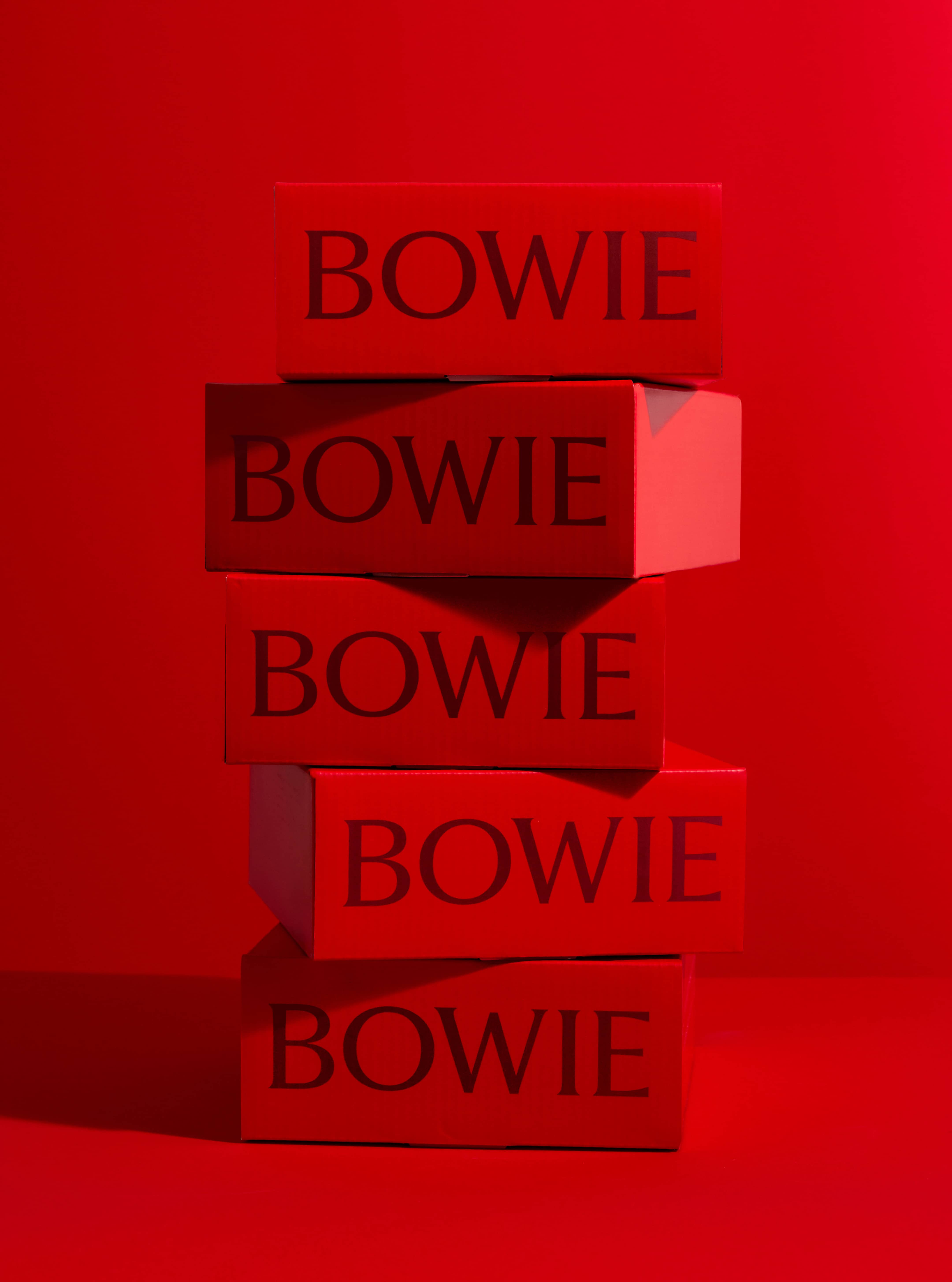
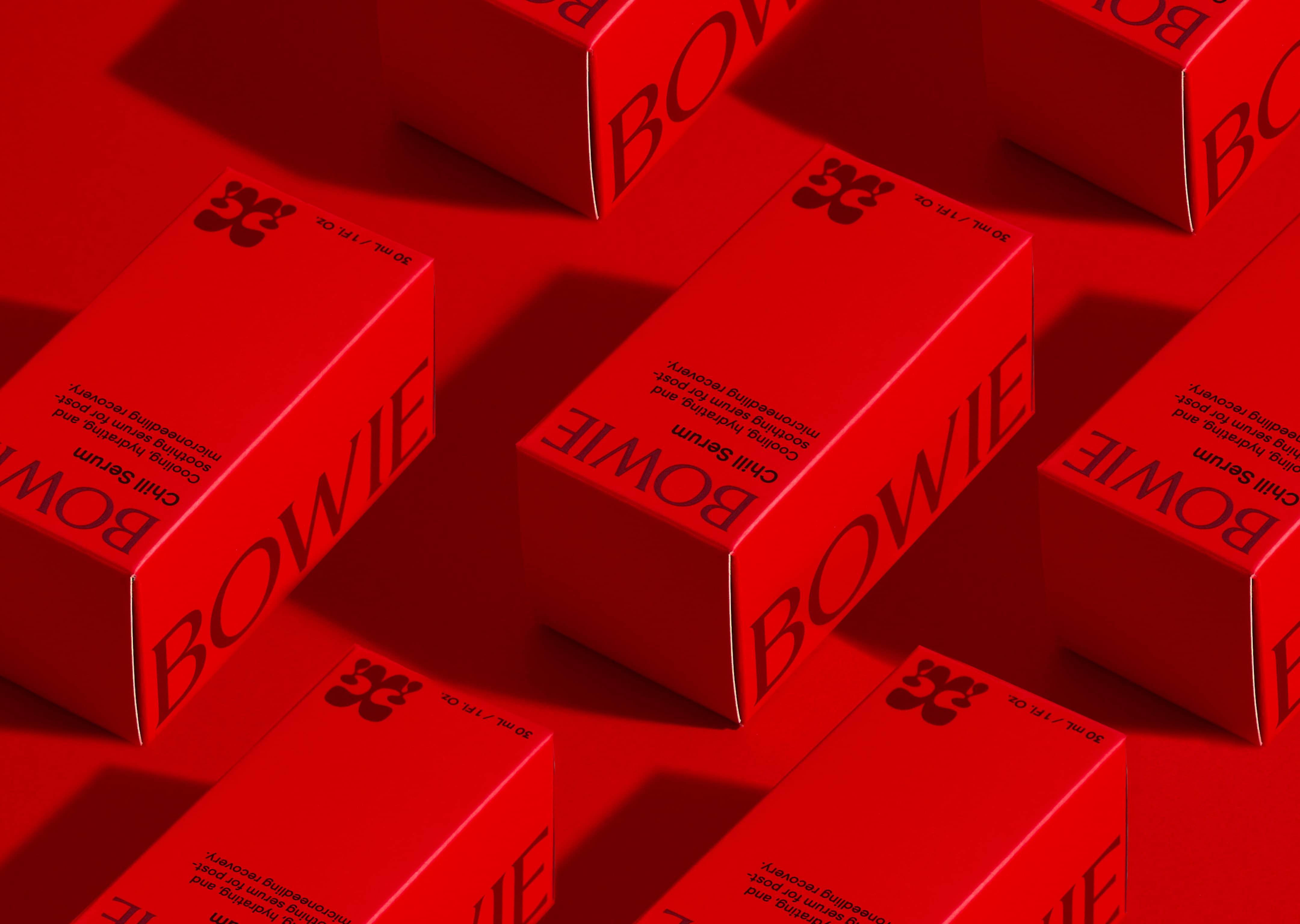
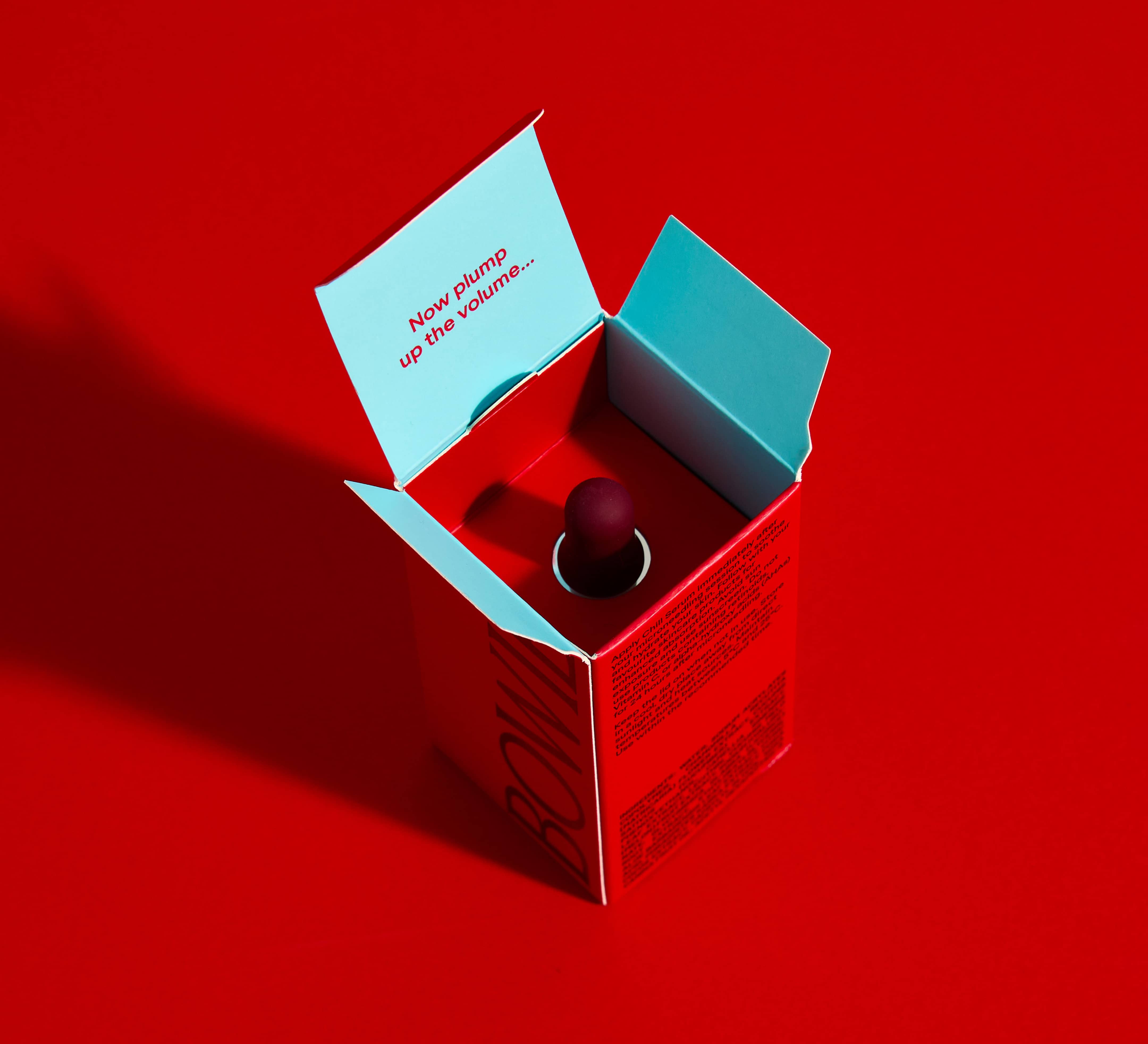
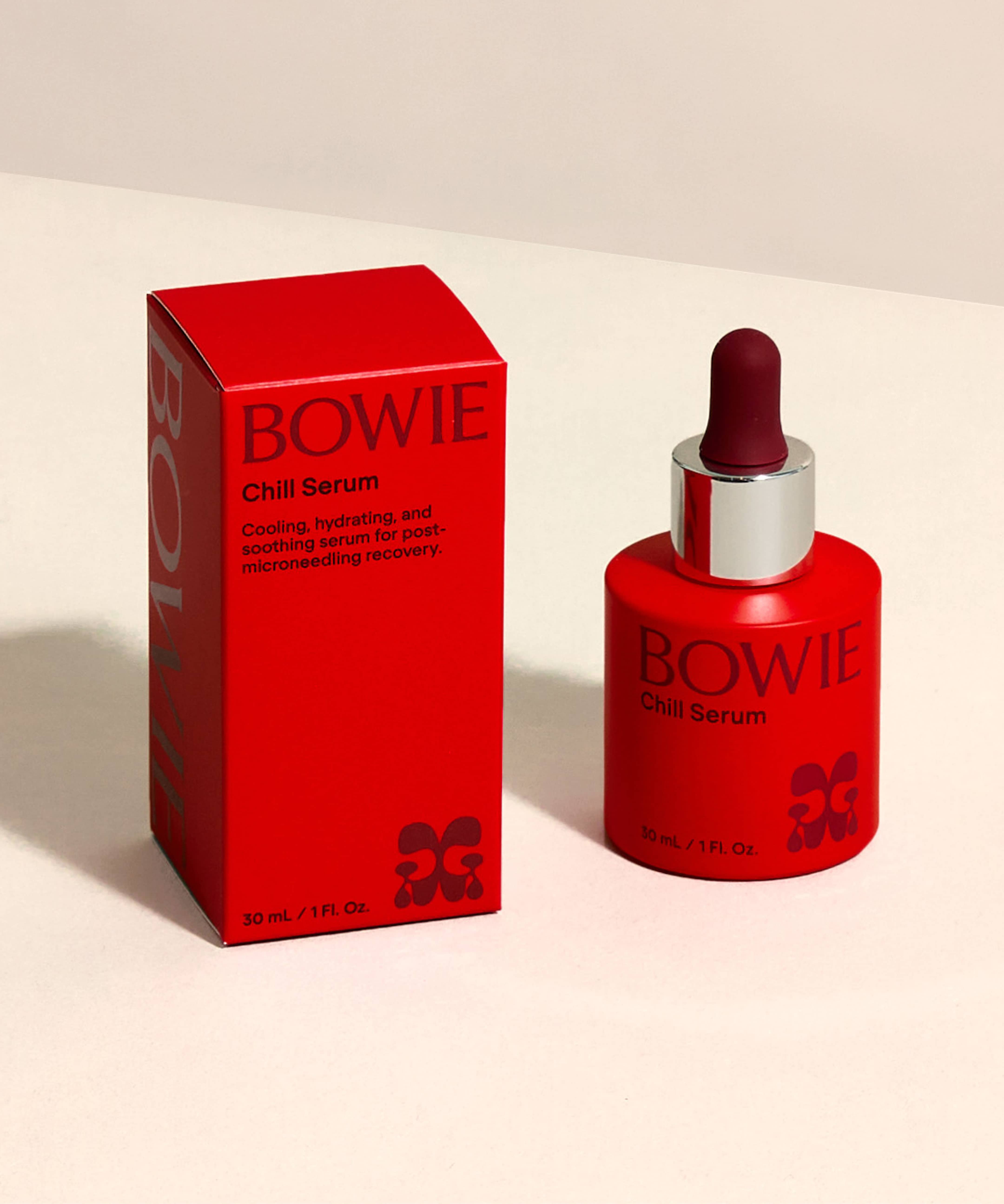
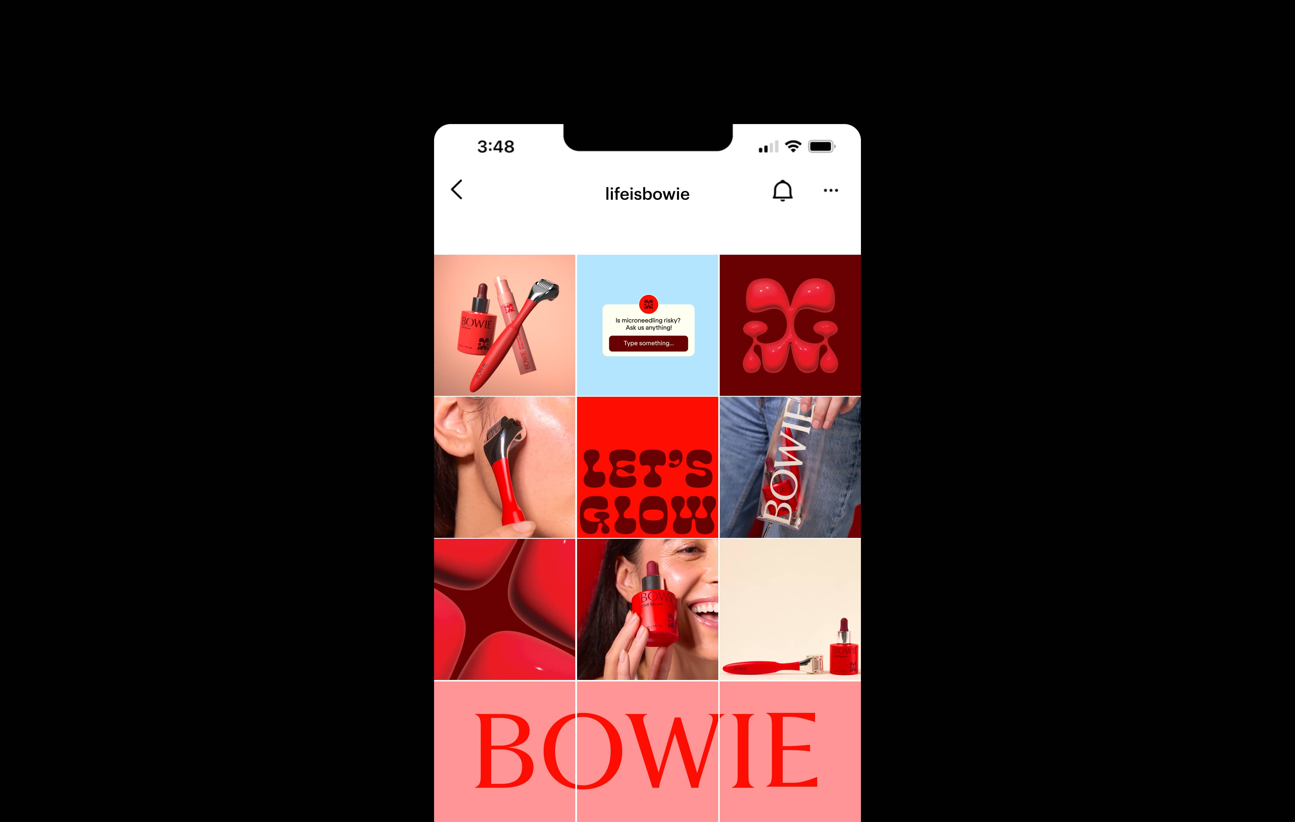
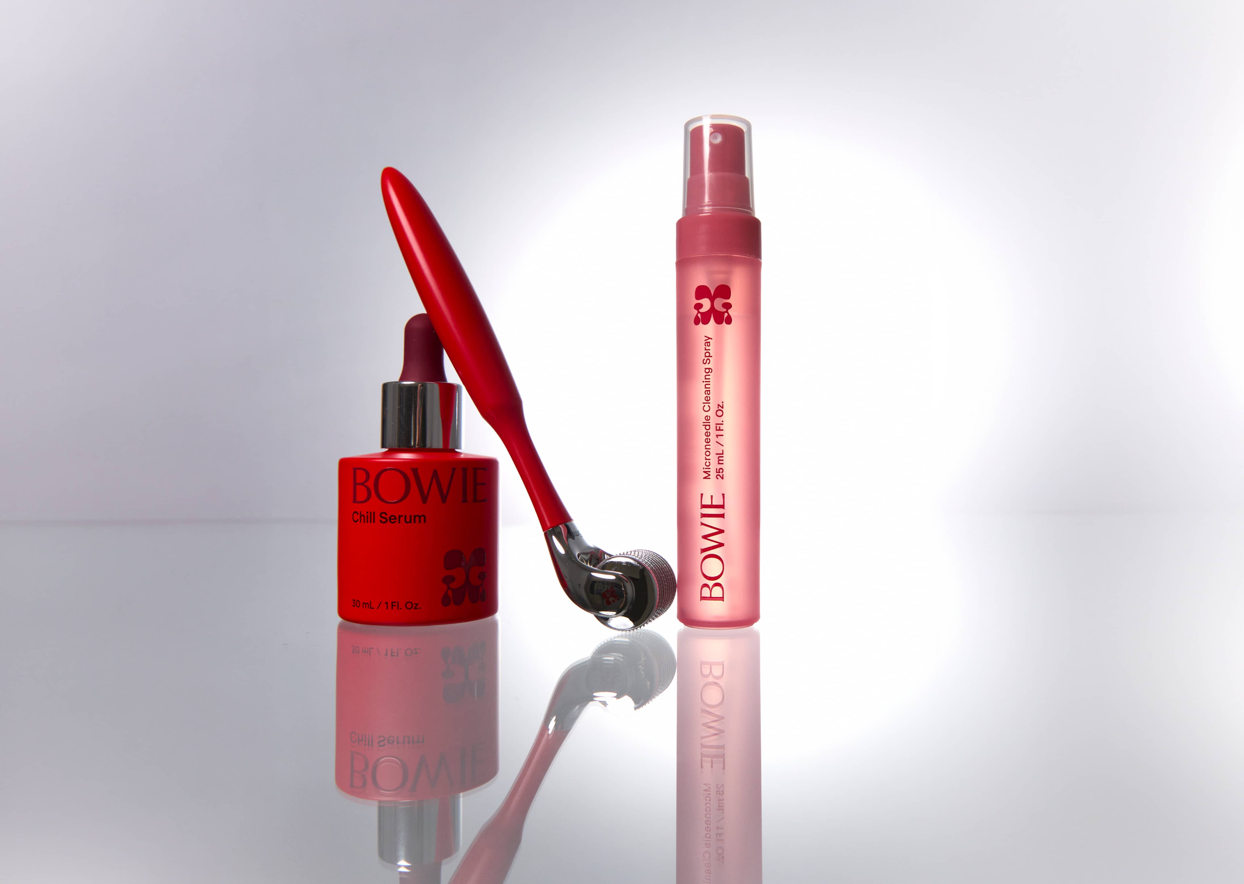
We focused on two key ideas: transformation, and the contrast within their audience. These themes shaped both the visual identity and tone of voice. Typographically we paired a playful, jelly-like typeface with one featuring sharp, needle-like points – reflecting the balance between softness and precision. The logo mark, an abstract butterfly, reinforces the idea of transformation.
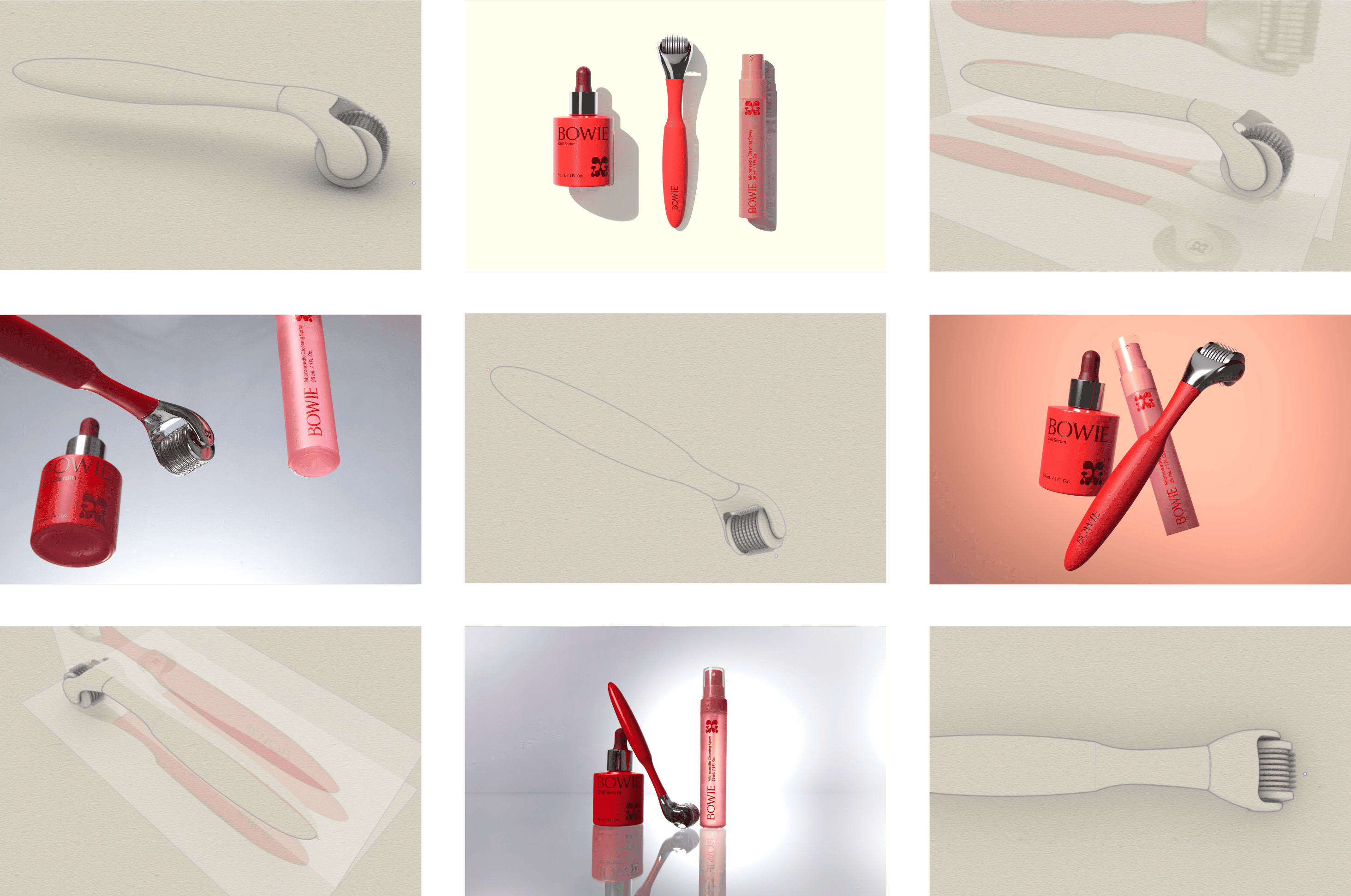
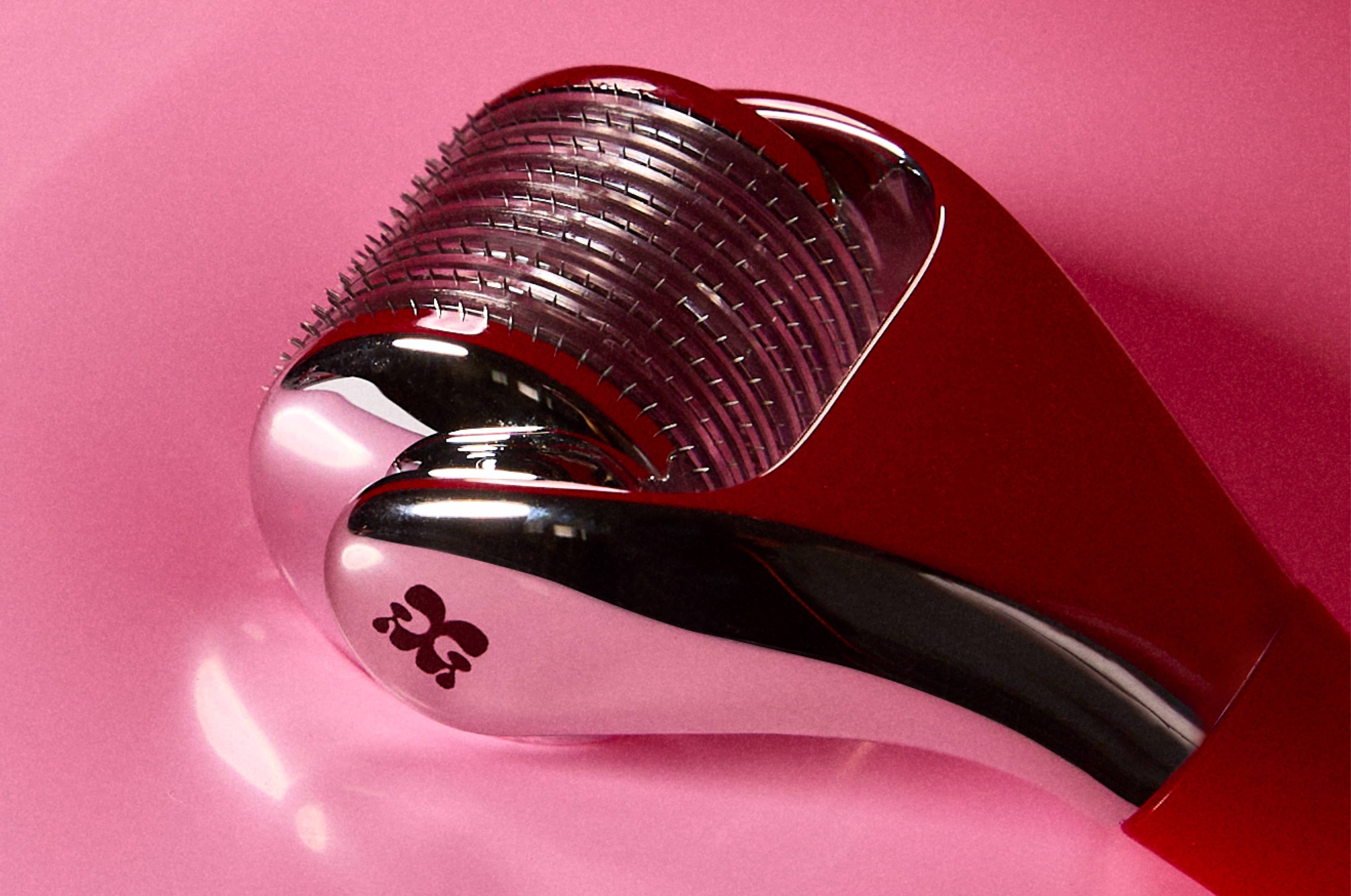
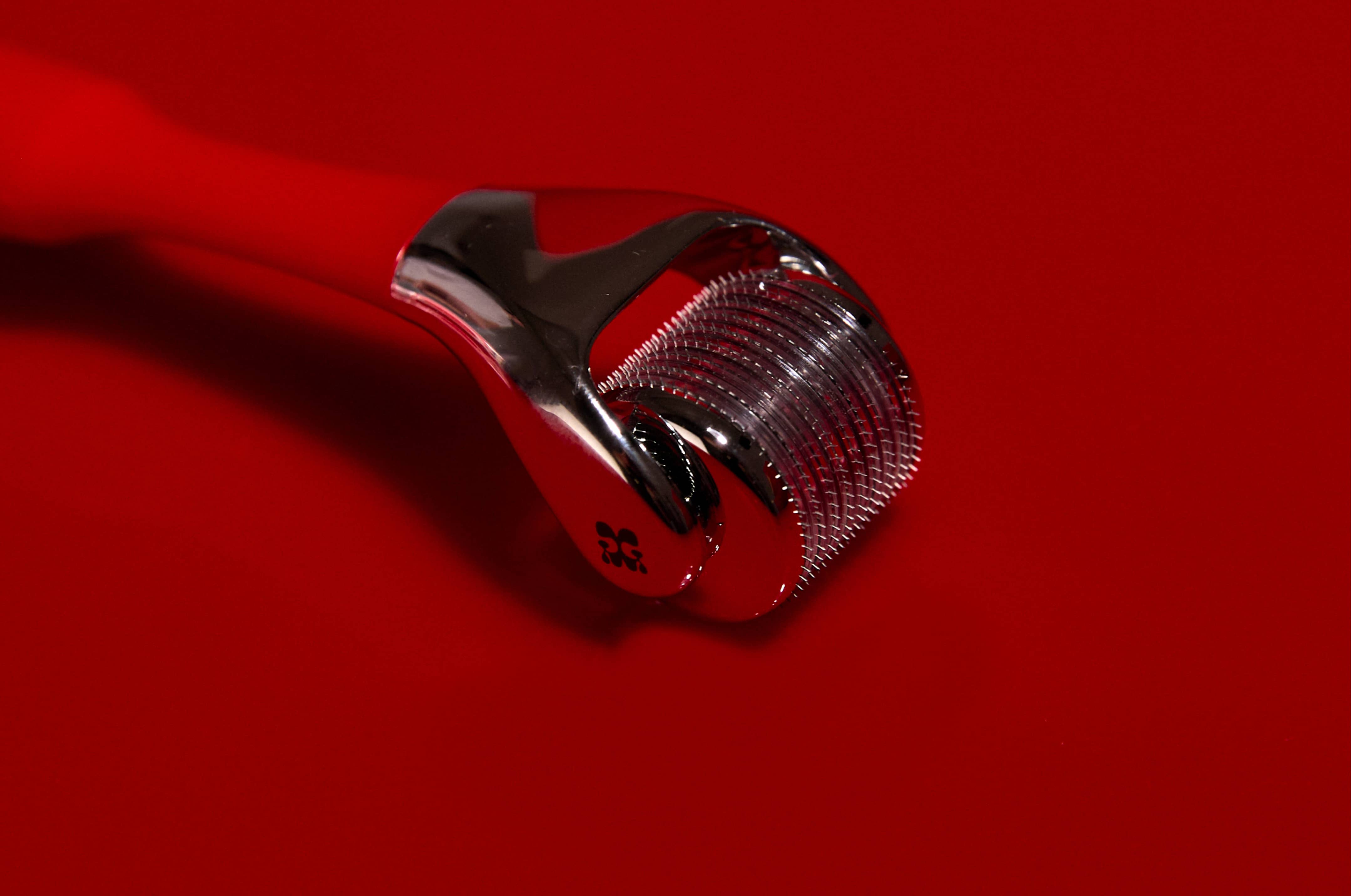
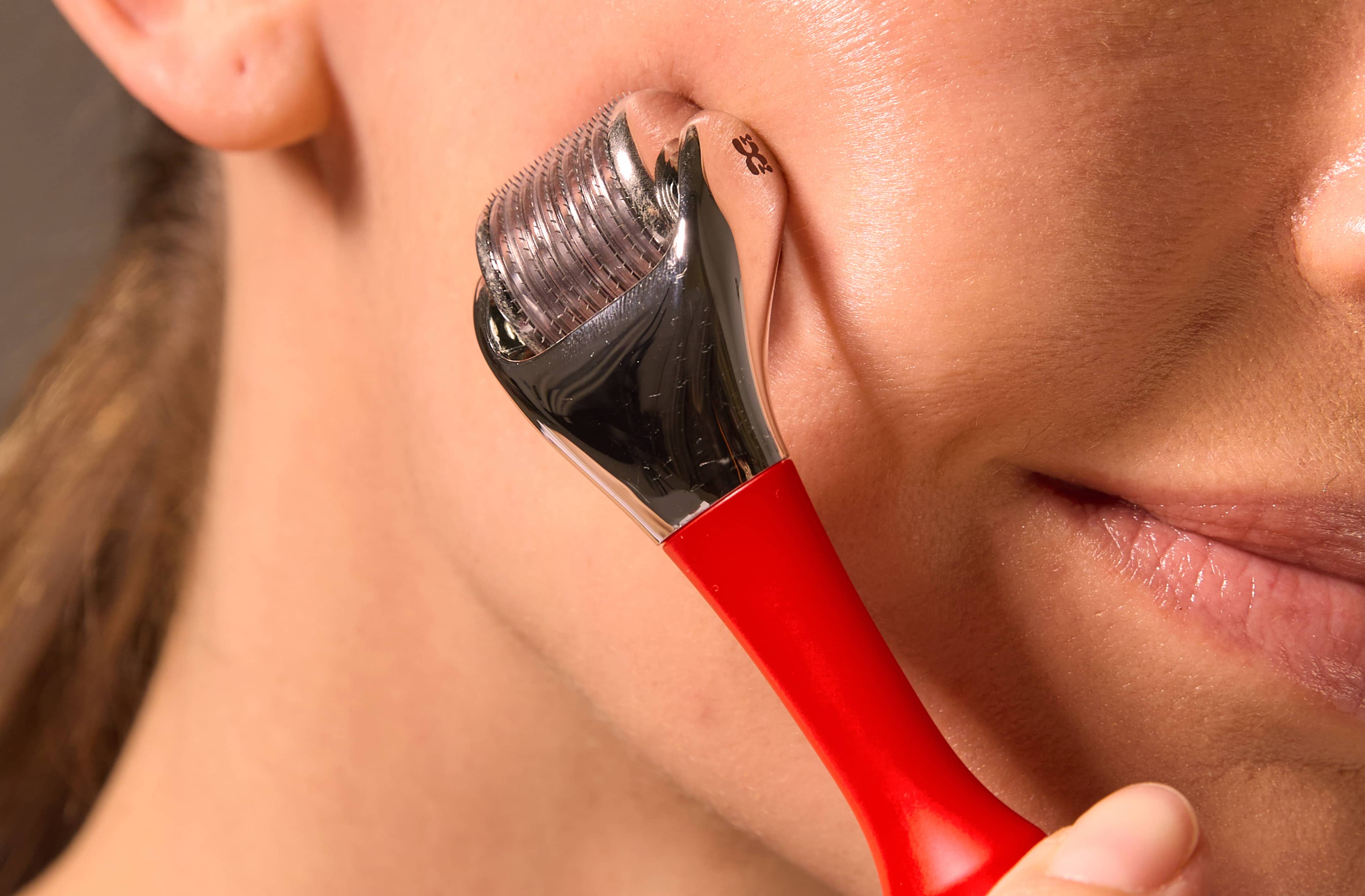
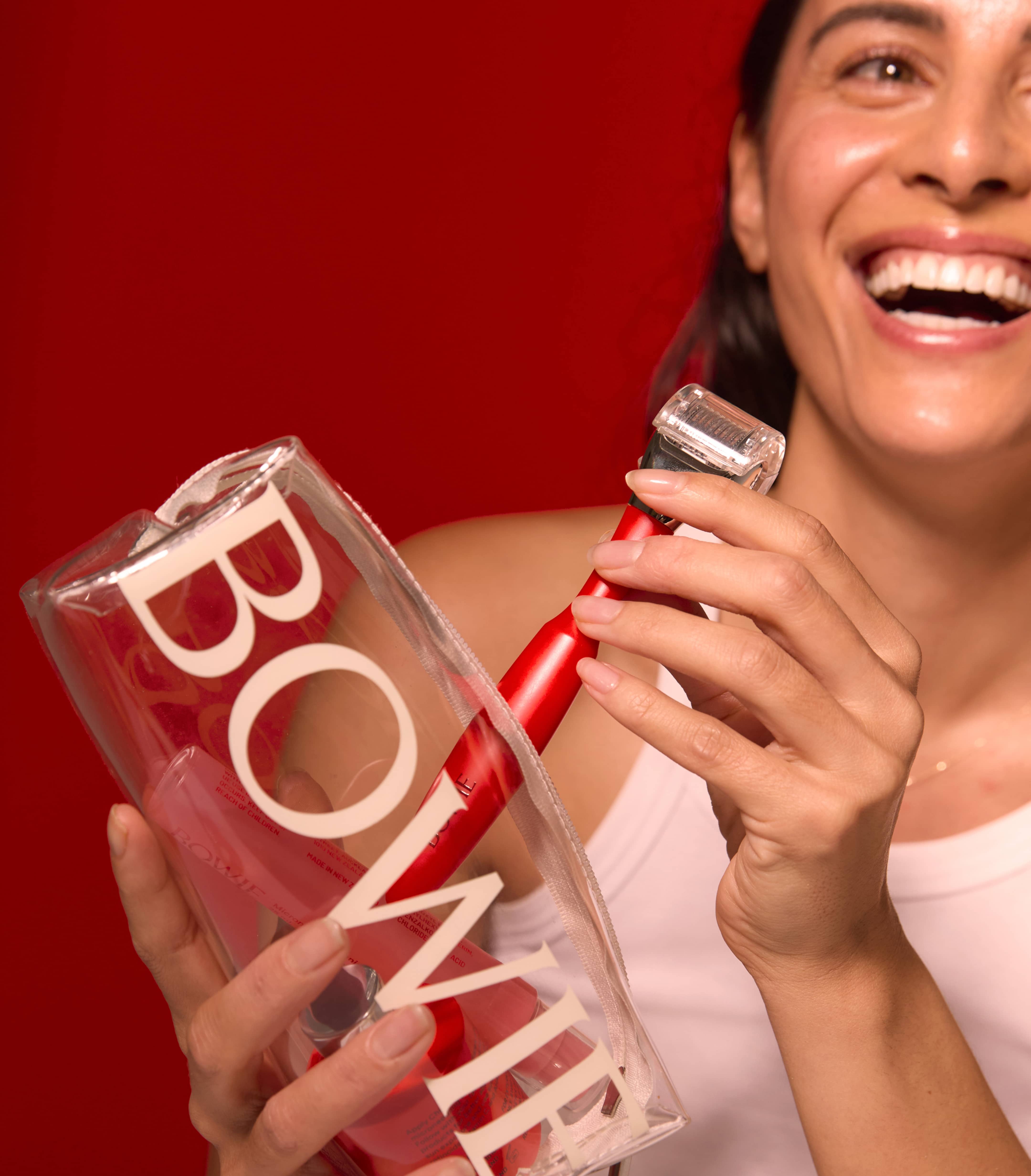
Collaborating closely with product designers, we crafted Bowie's bespoke microneedling tool, which features a handle that aligns with our brand's aesthetic in shape while remaining intuitive.
A content shoot with Mark by South brought the brand to life. Unique art direction involved pressing the tool into balloons to evoke plump, hydrated skin and the tension of the microneedling process.
Services
Brand strategy and foundations
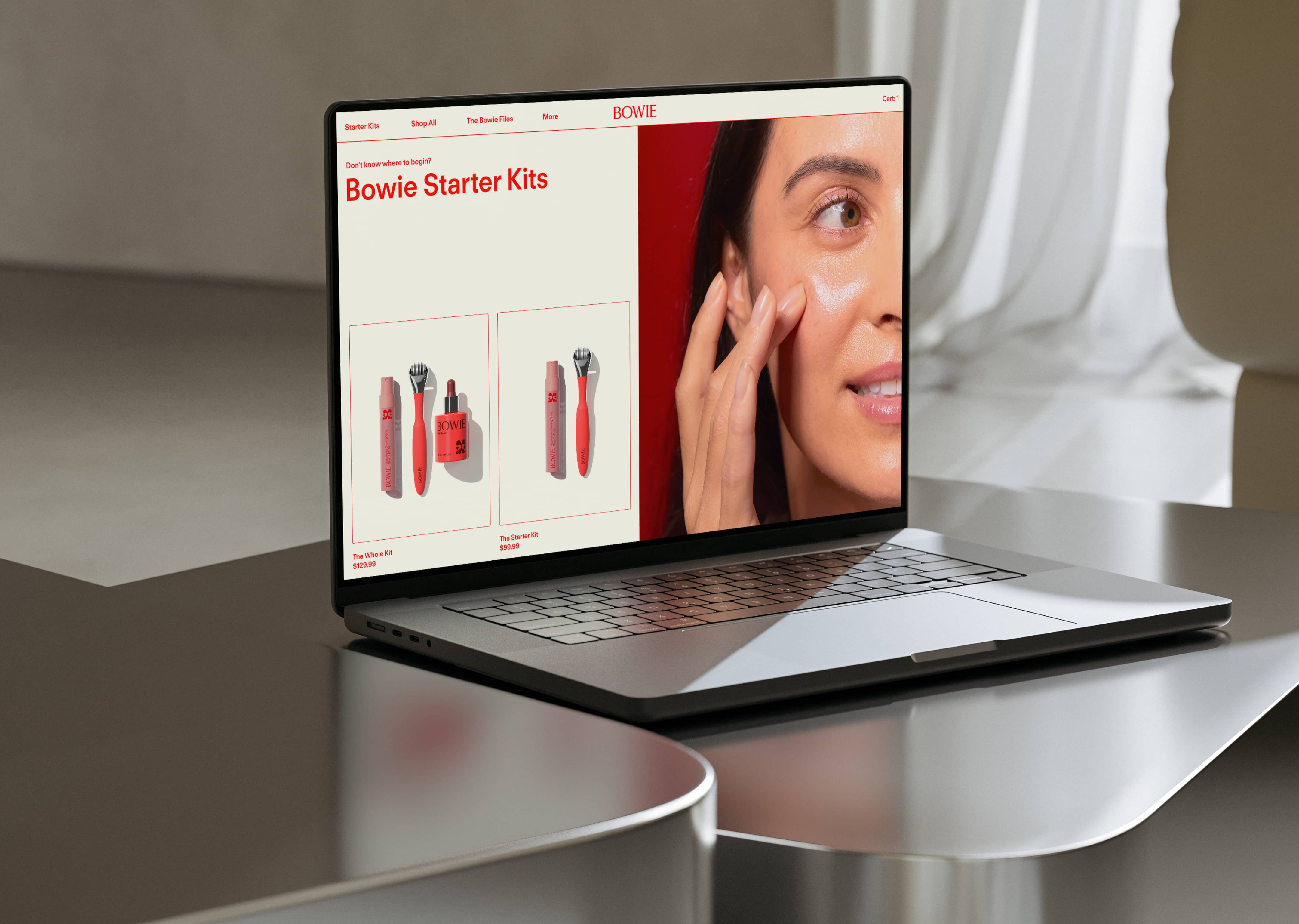
Brand identity
Website design and code
Motion design
Product Design
Art Direction
Photography
Mark By South Clara Jane
Development
KiwiSprout
3D and Product Design
Oscar Fernandez
4Design