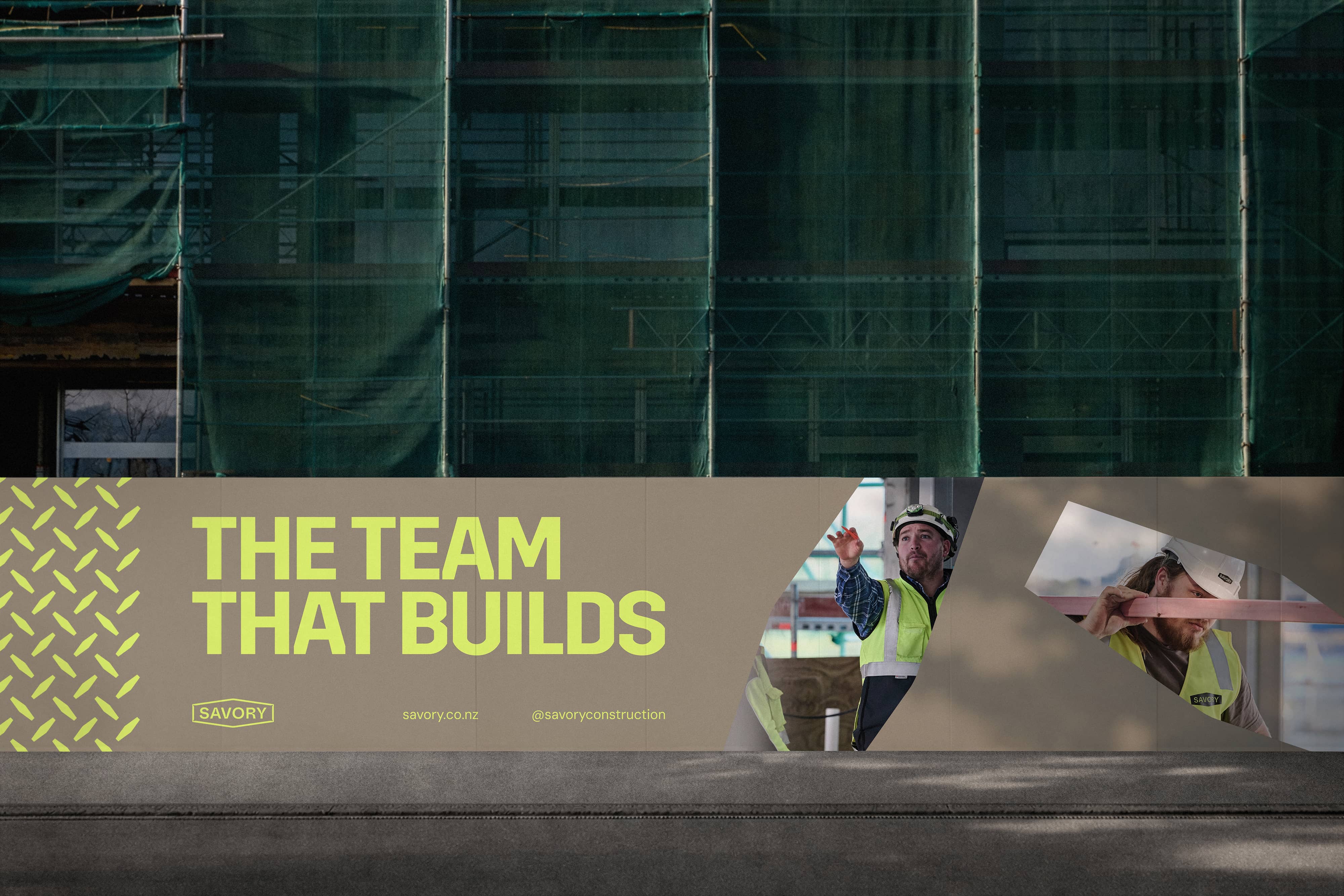
The team that builds.
Savory is one of New Zealand’s longest-established construction companies, built on decades of trust, craft, and people who simply get the job done. Over time, however, their brand no longer reflected the true scale, capability, or culture of the business.
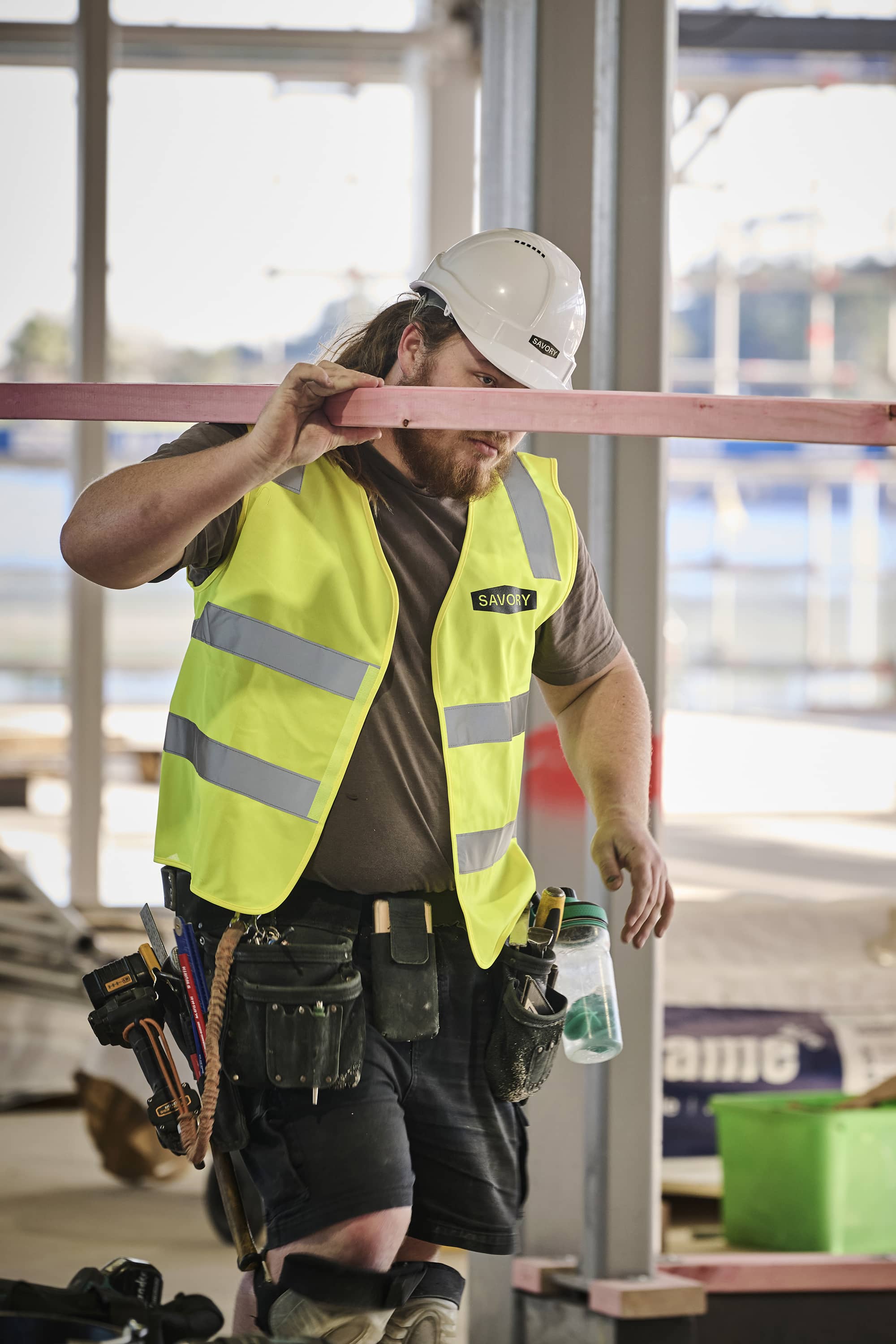
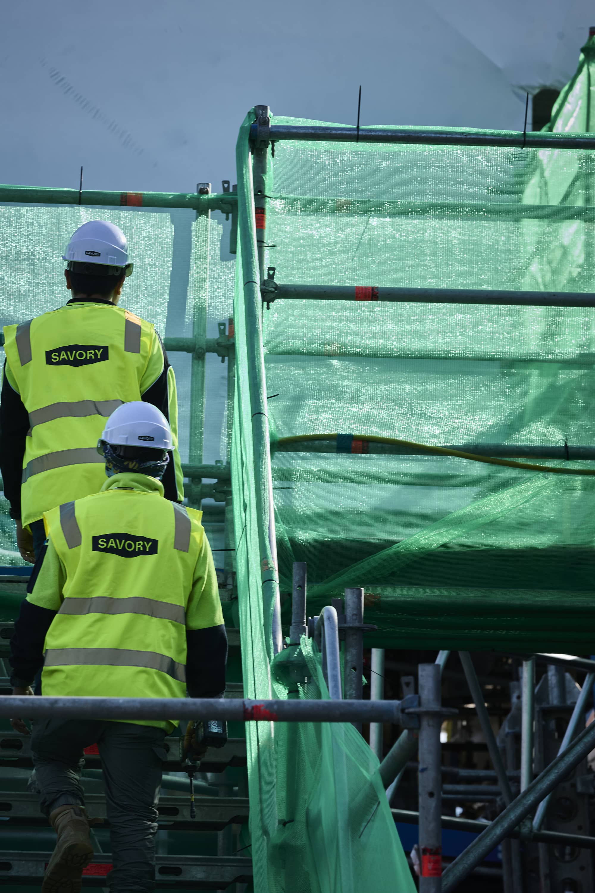
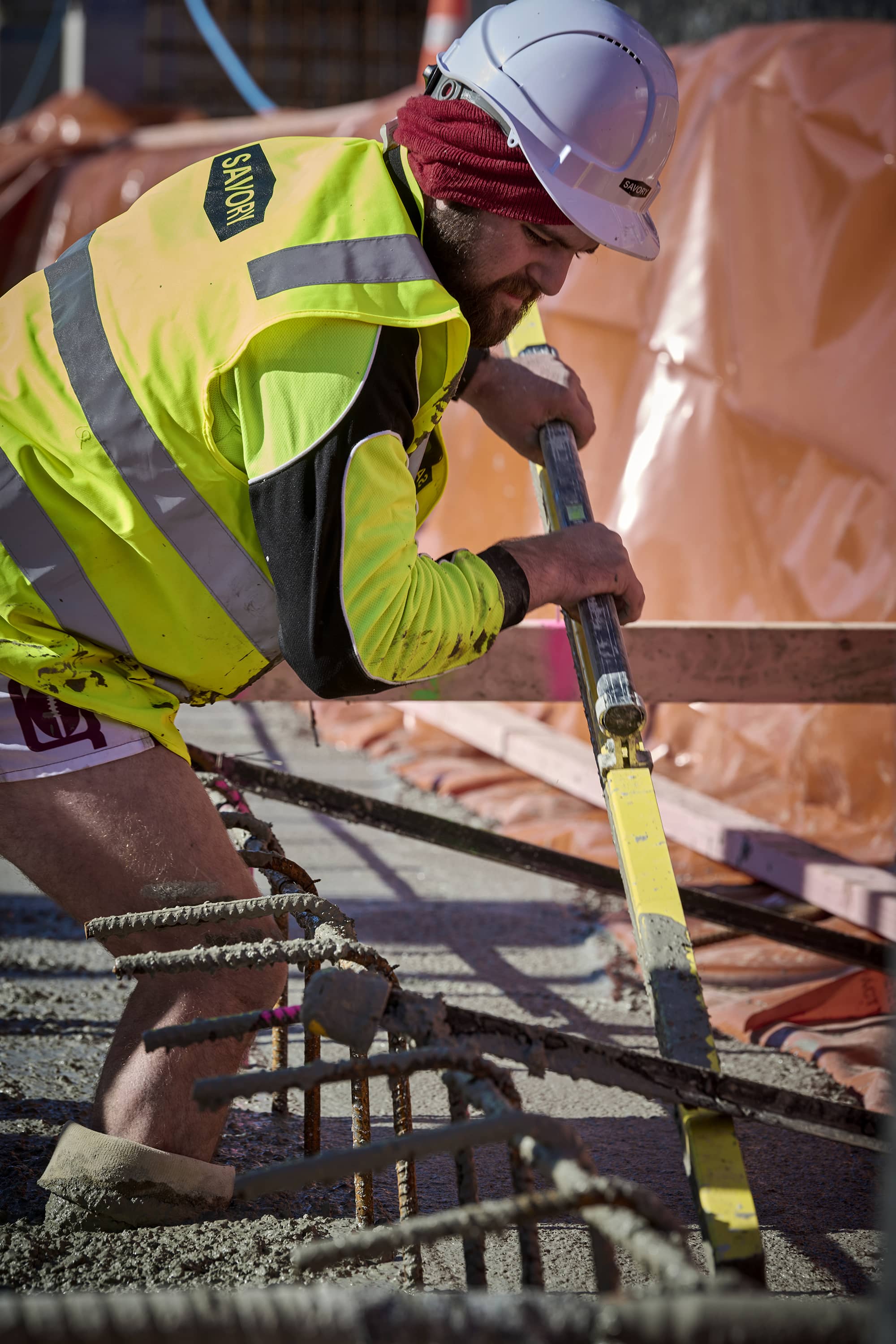
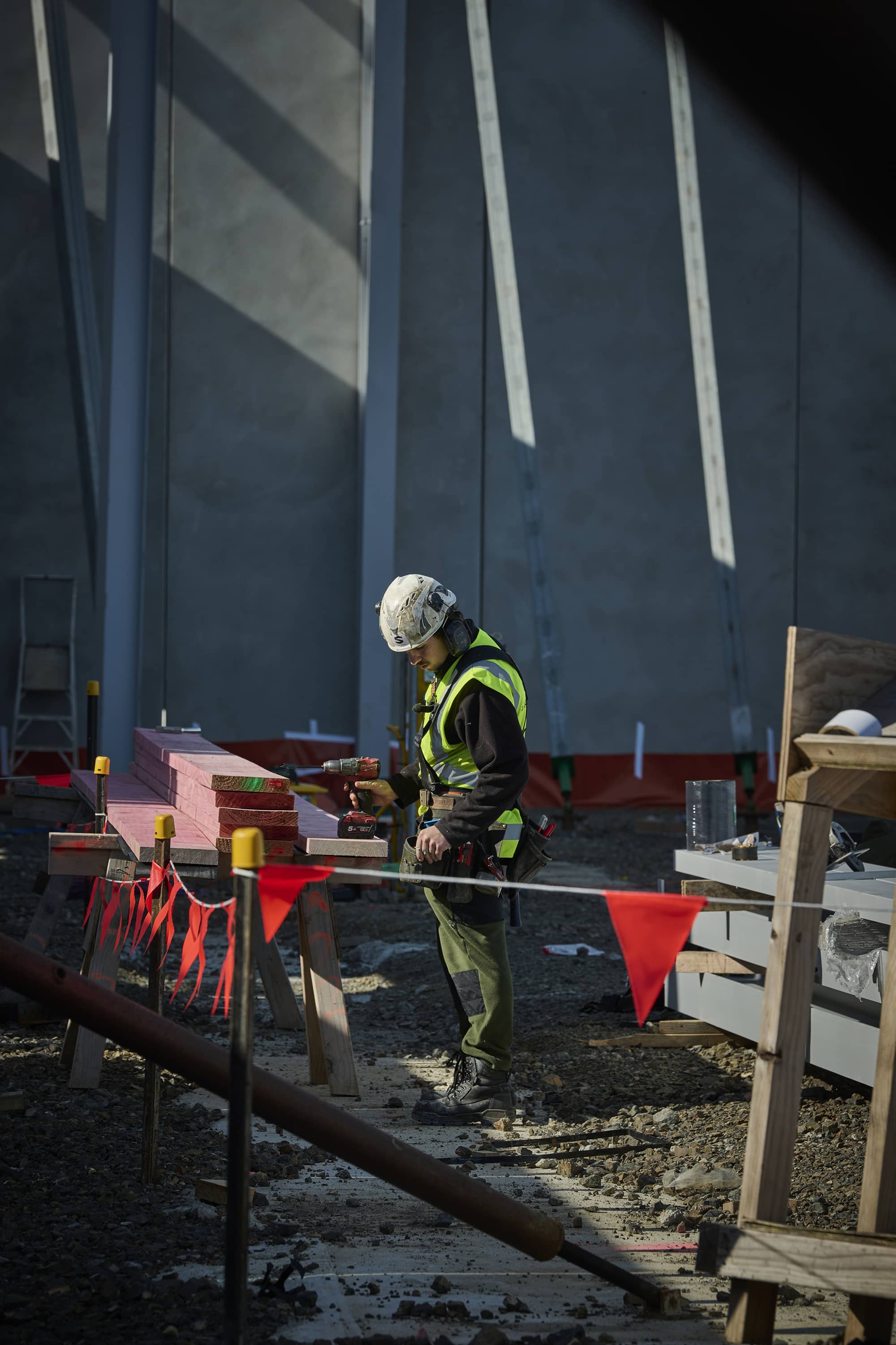
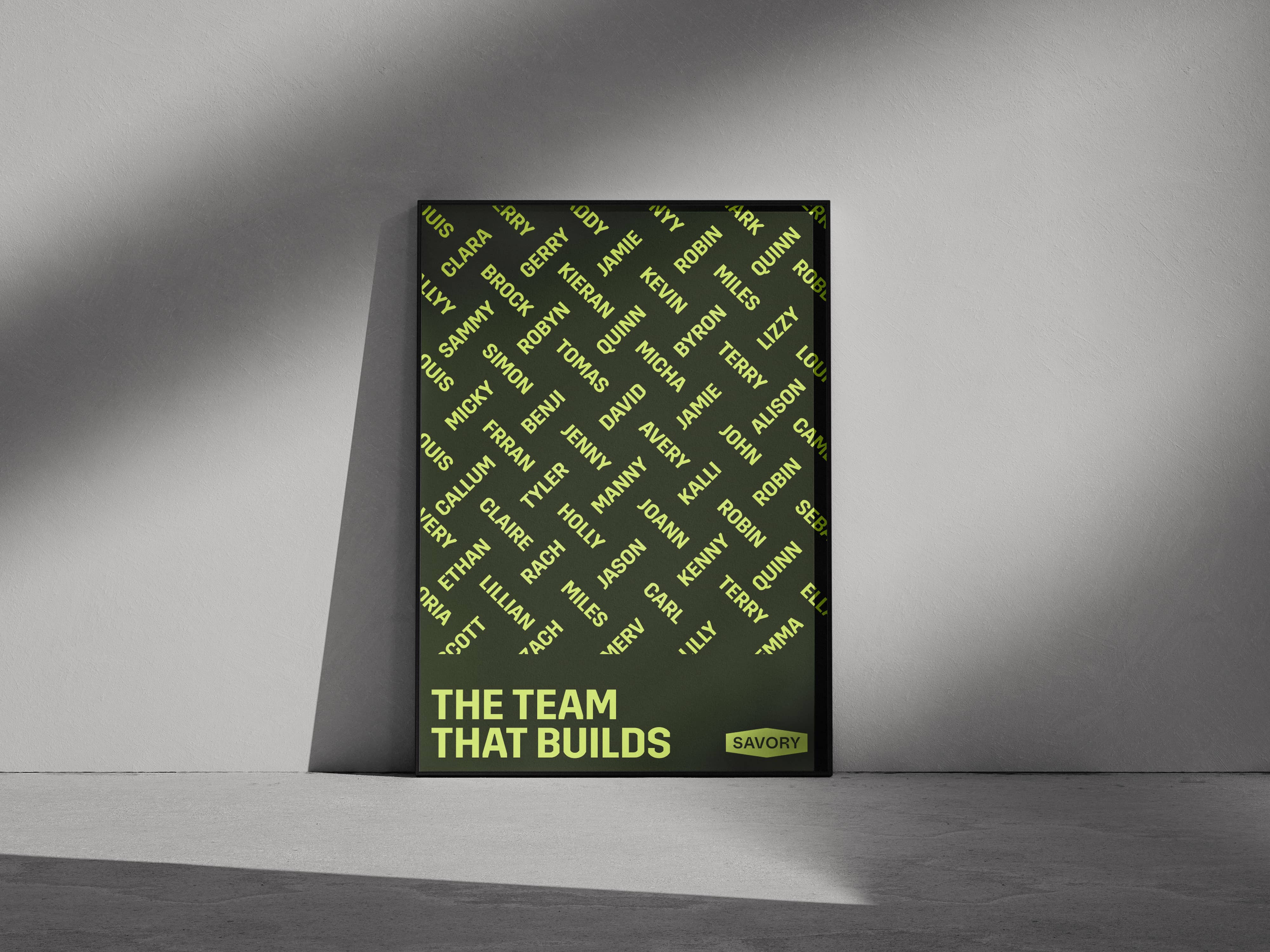
The rebrand brings Savory’s identity back into alignment with who they are today: grounded, progressive, and proudly hands-on. It places their people at the centre of the story, celebrating the collective effort behind every build and the belief that no matter the role, everyone gets their hands dirty.
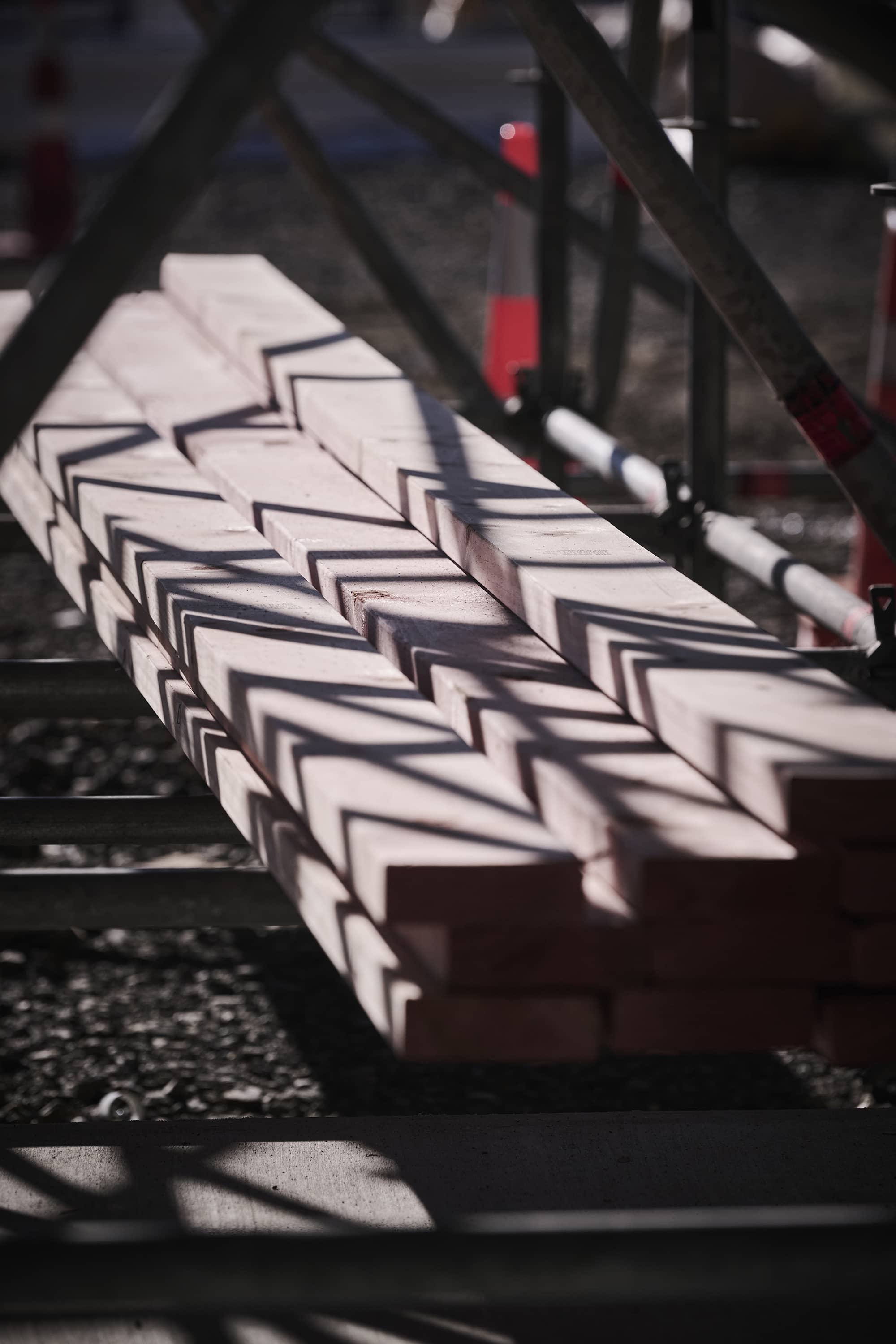
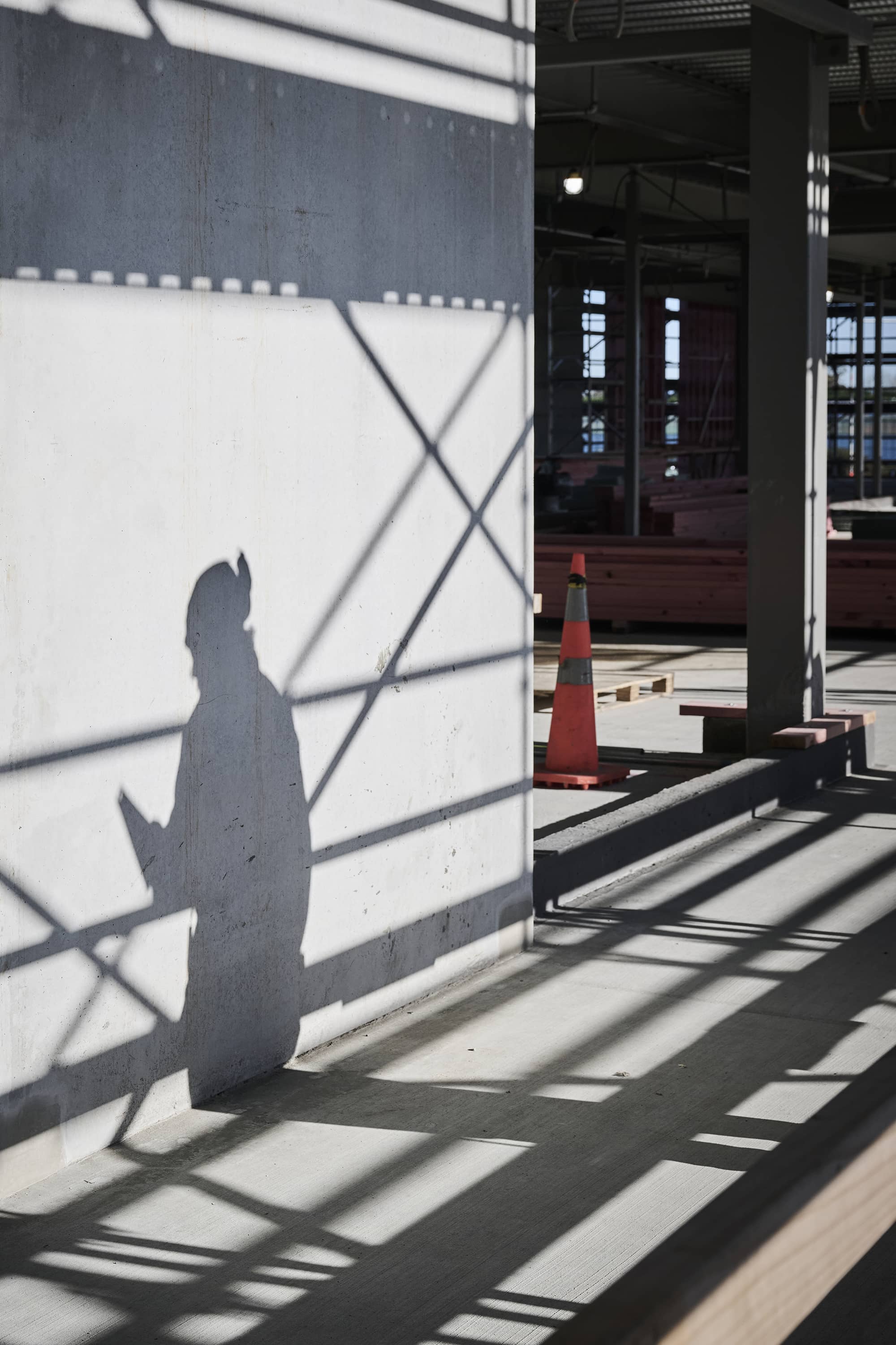
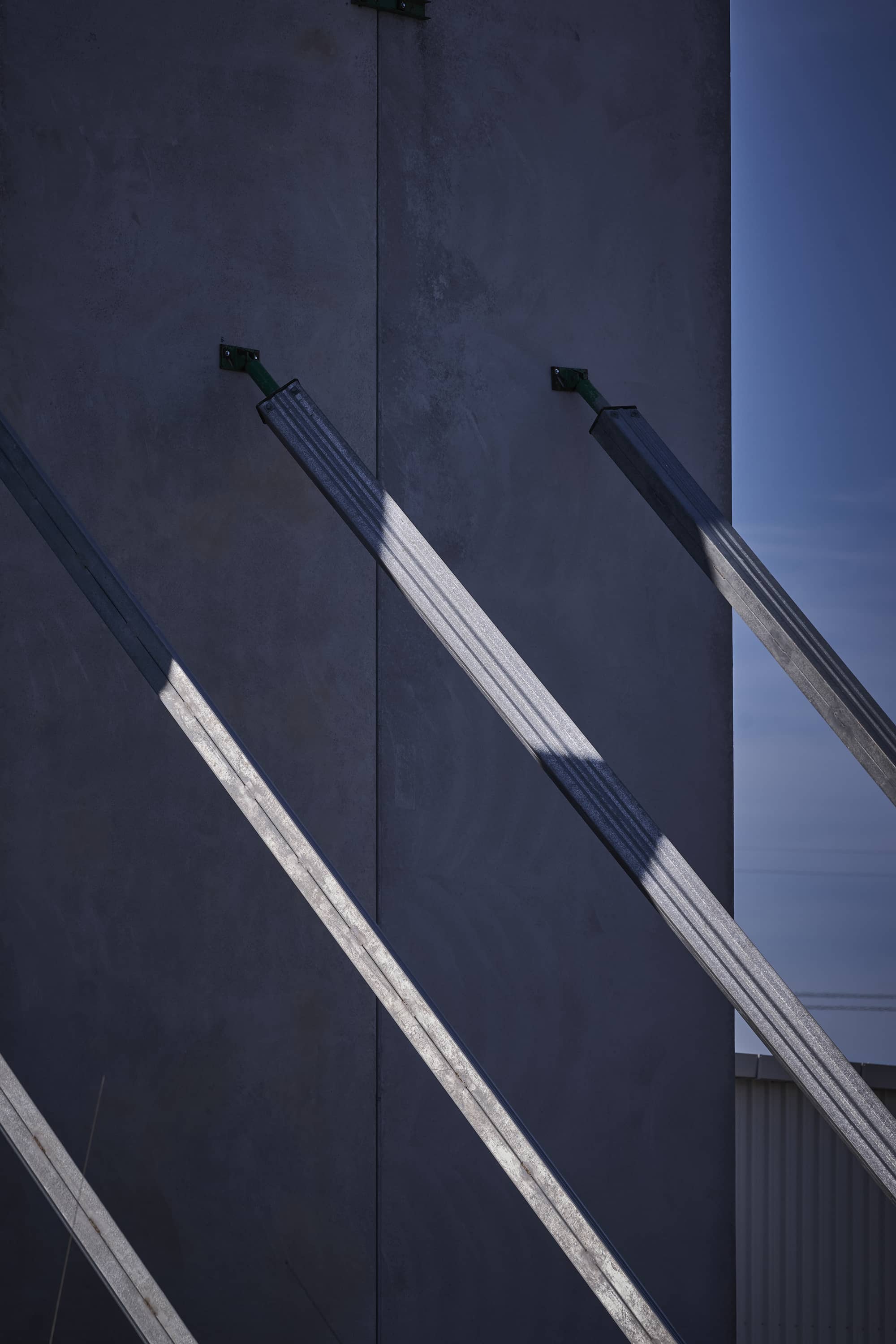
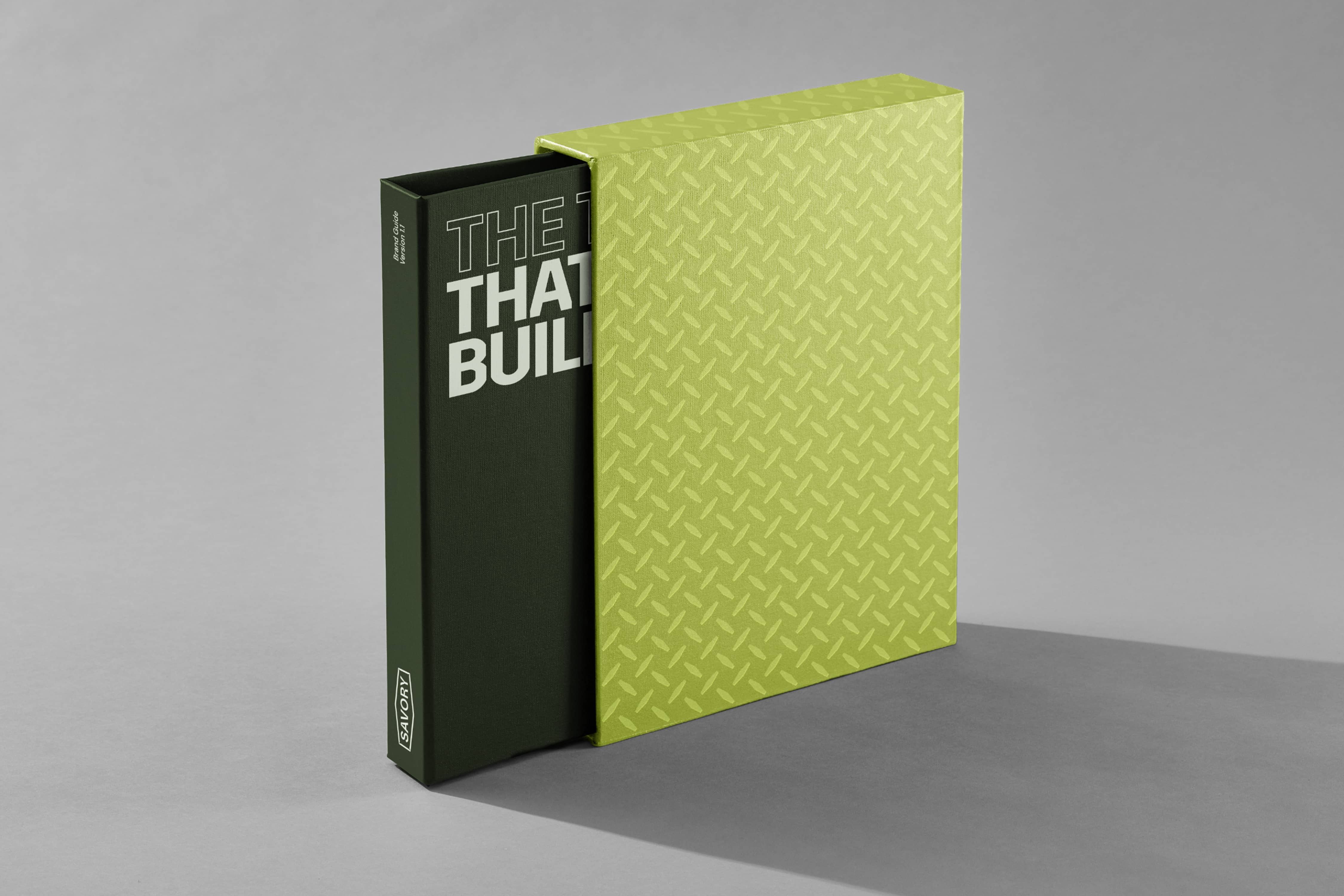
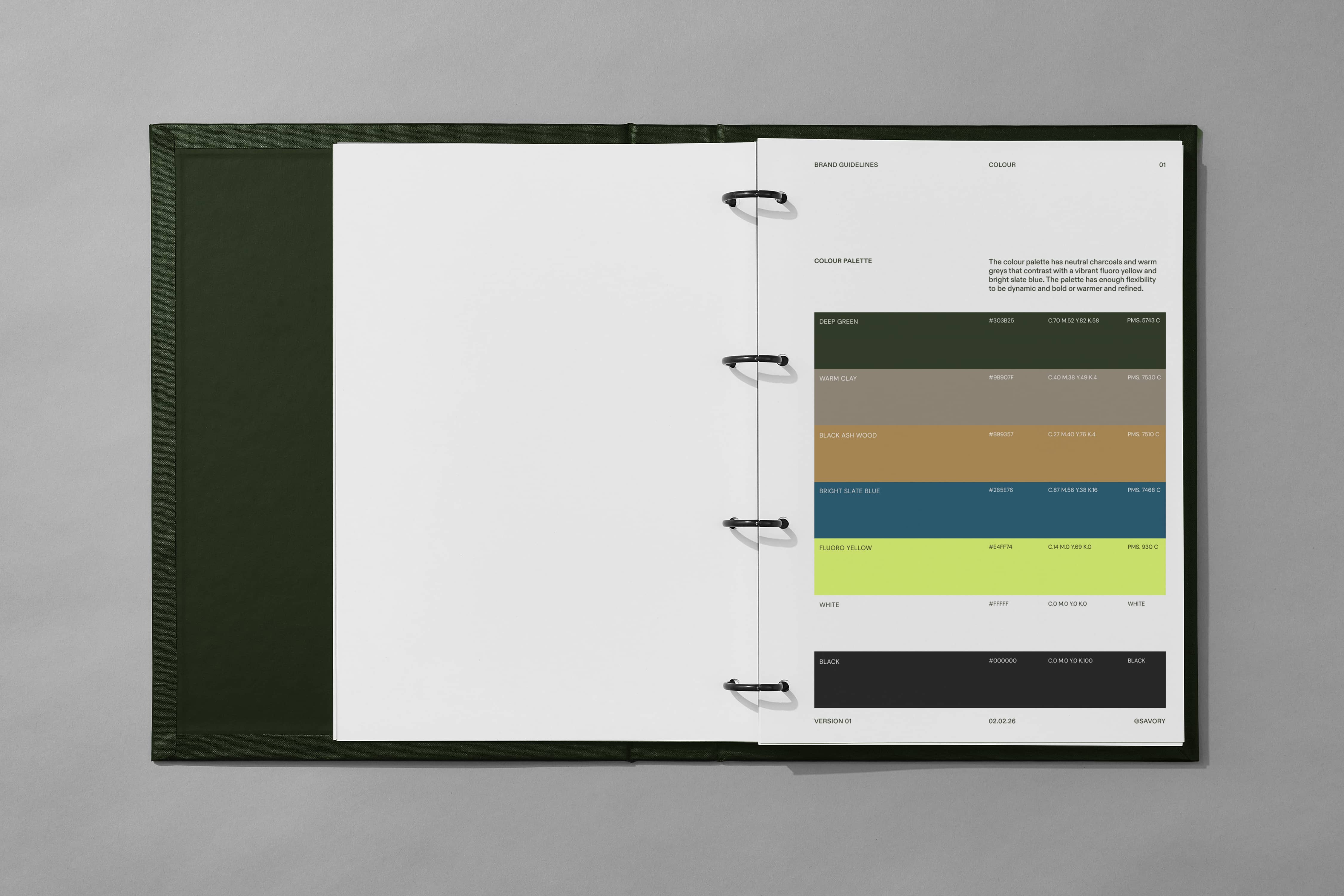
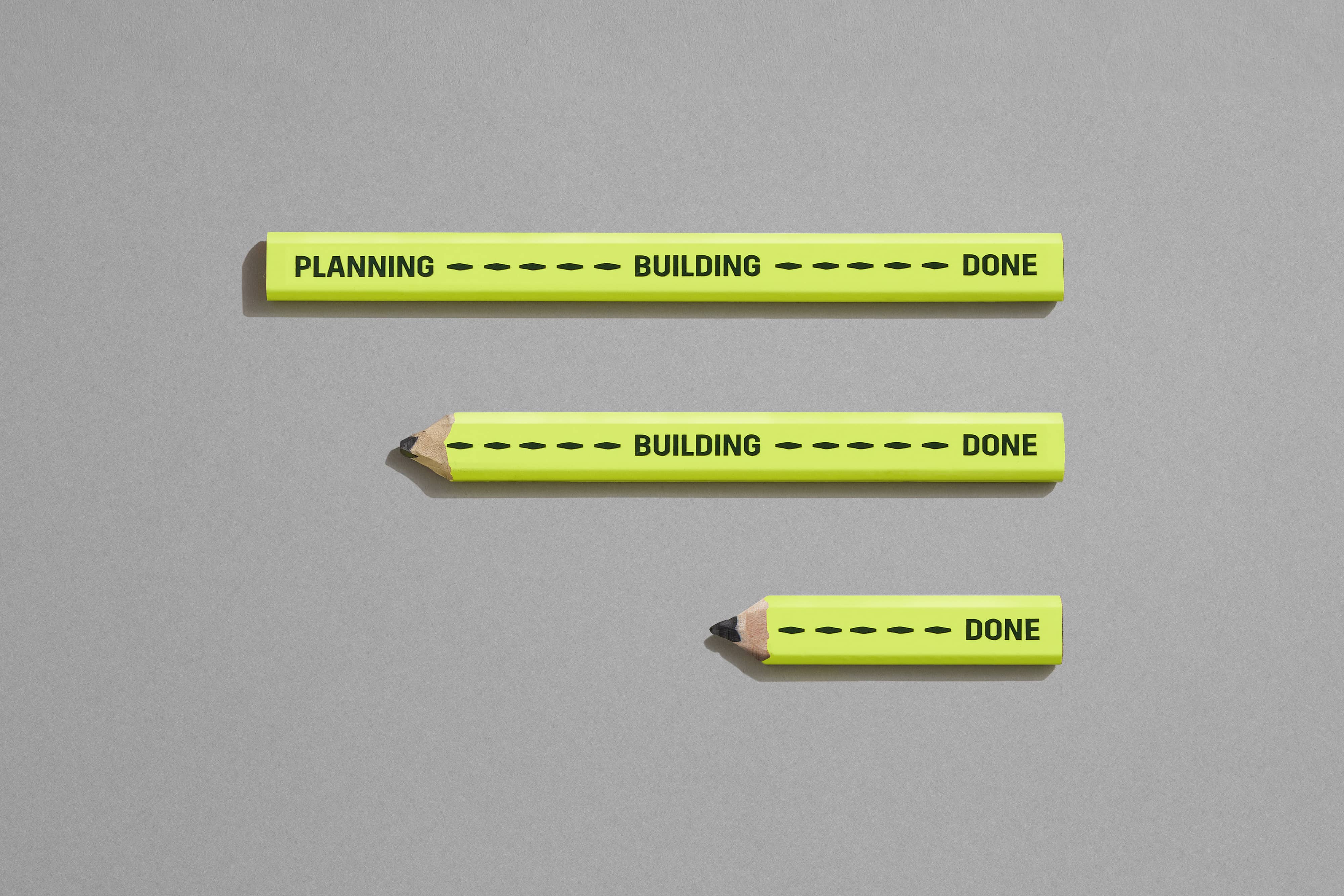
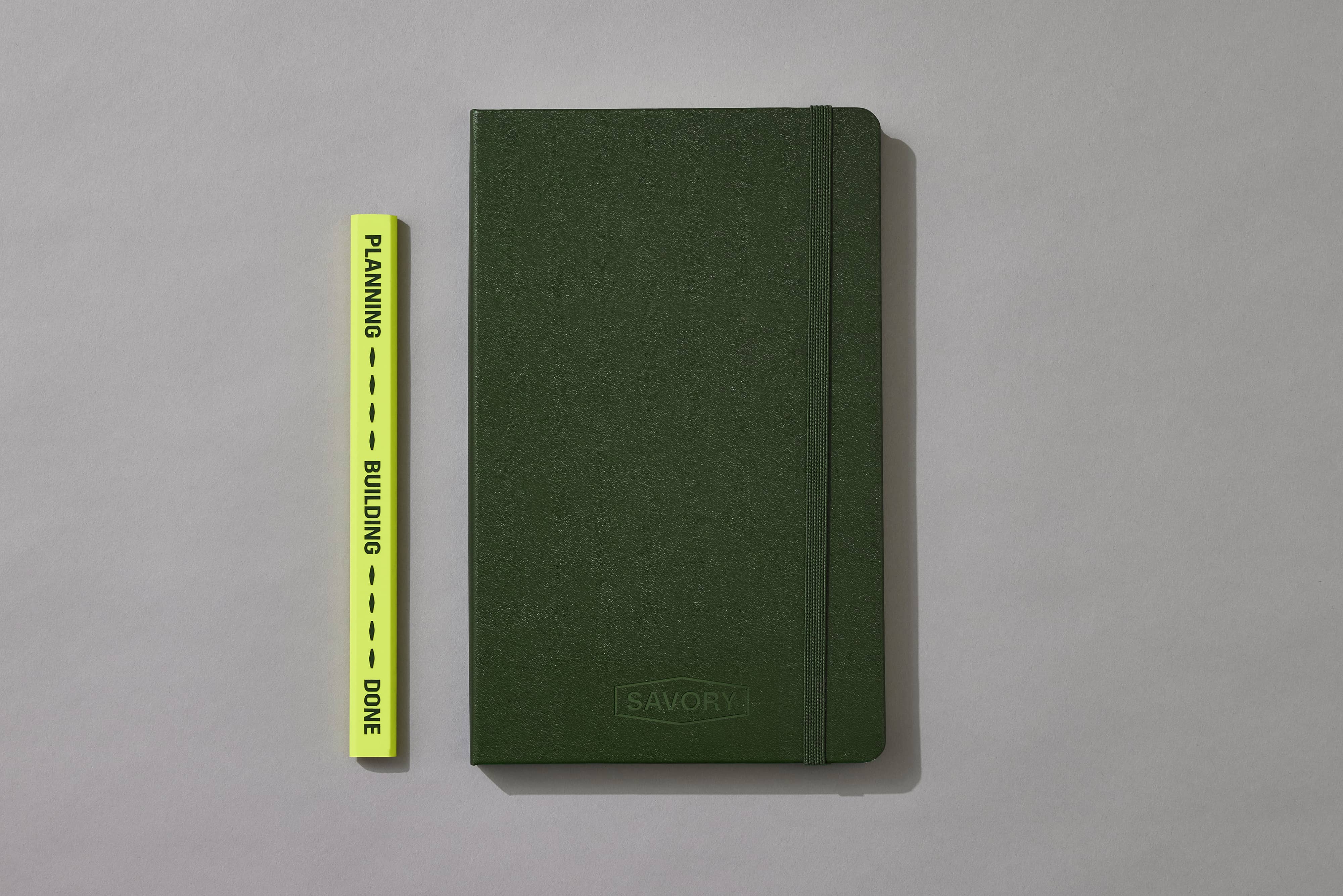
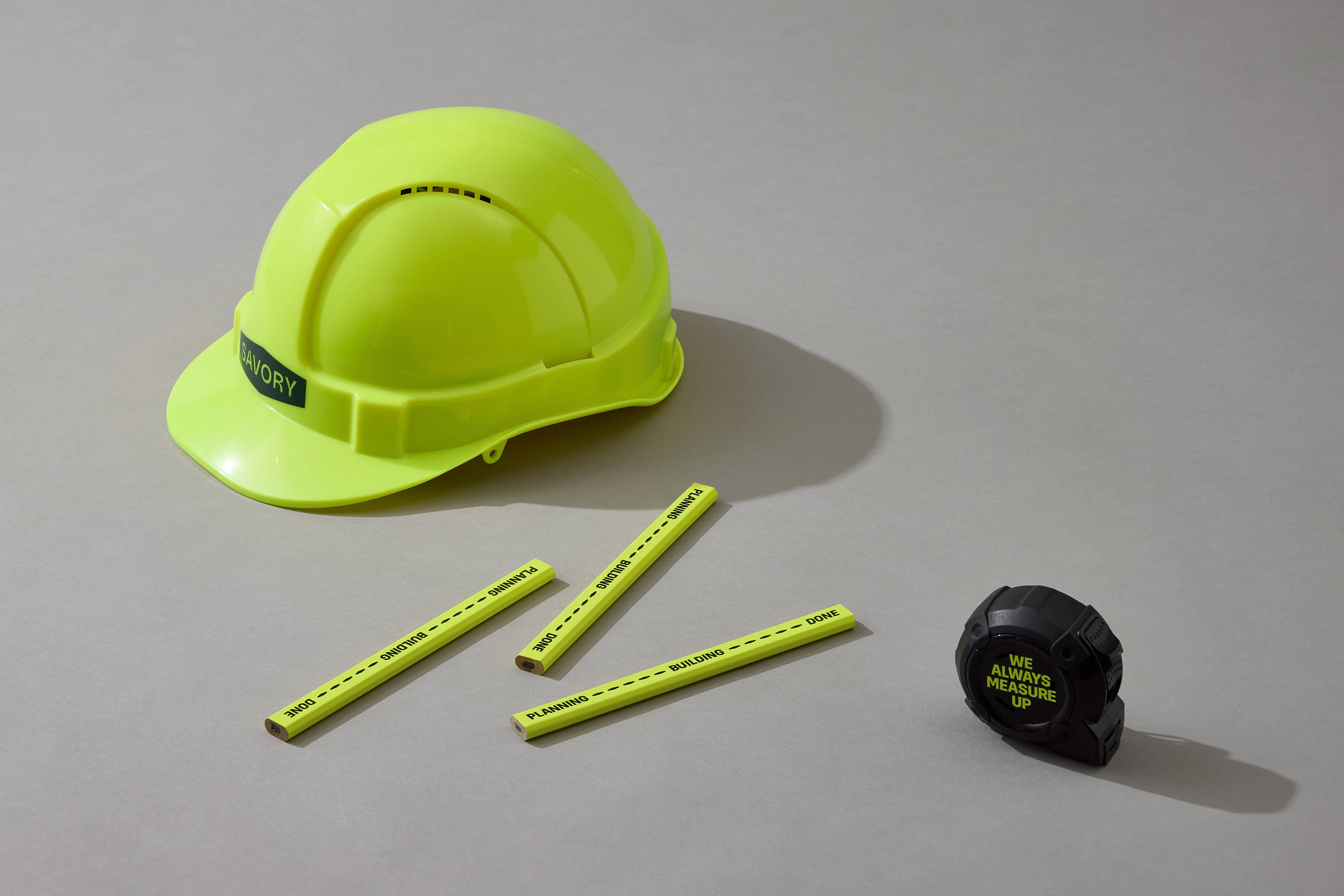
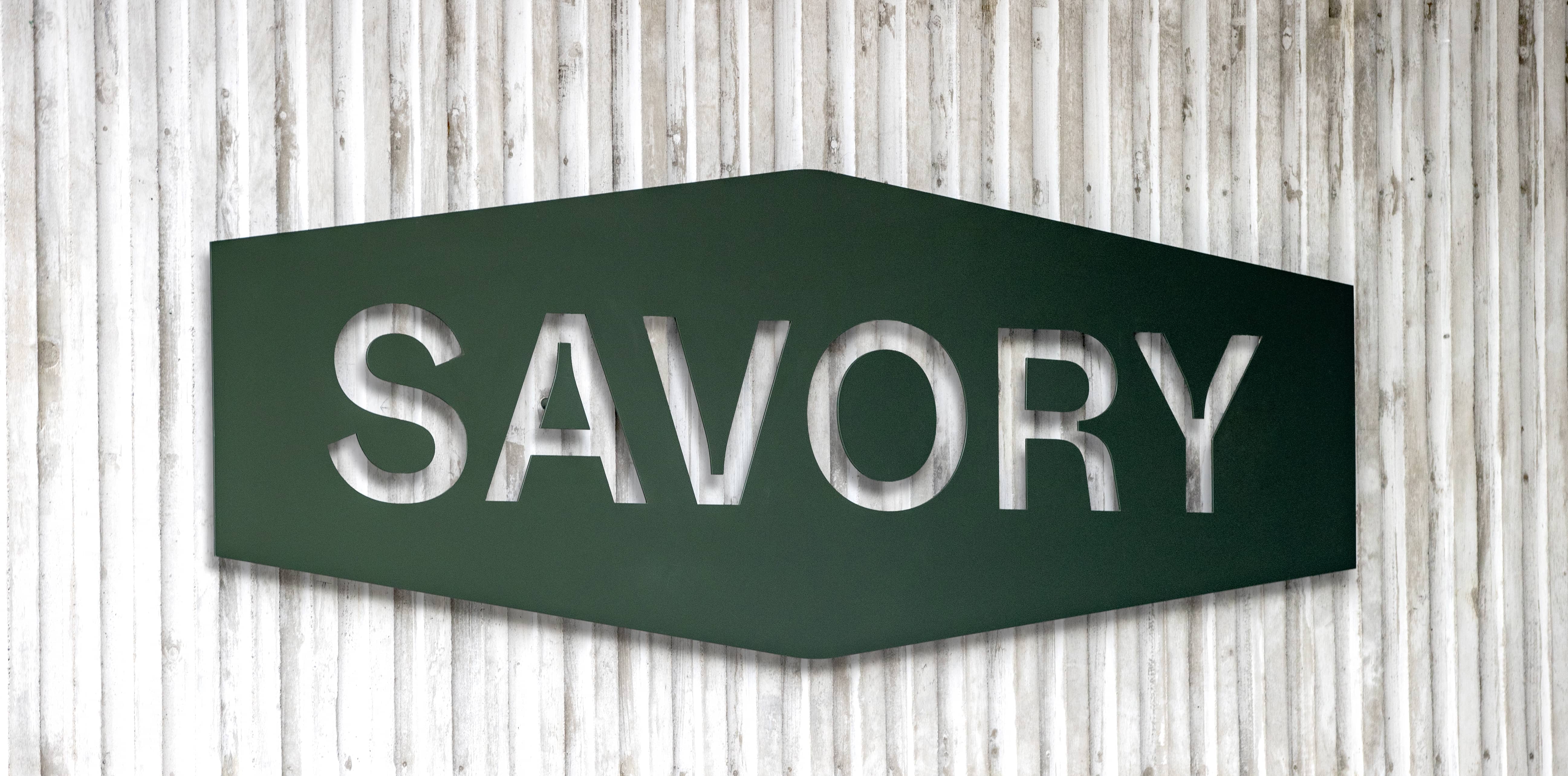
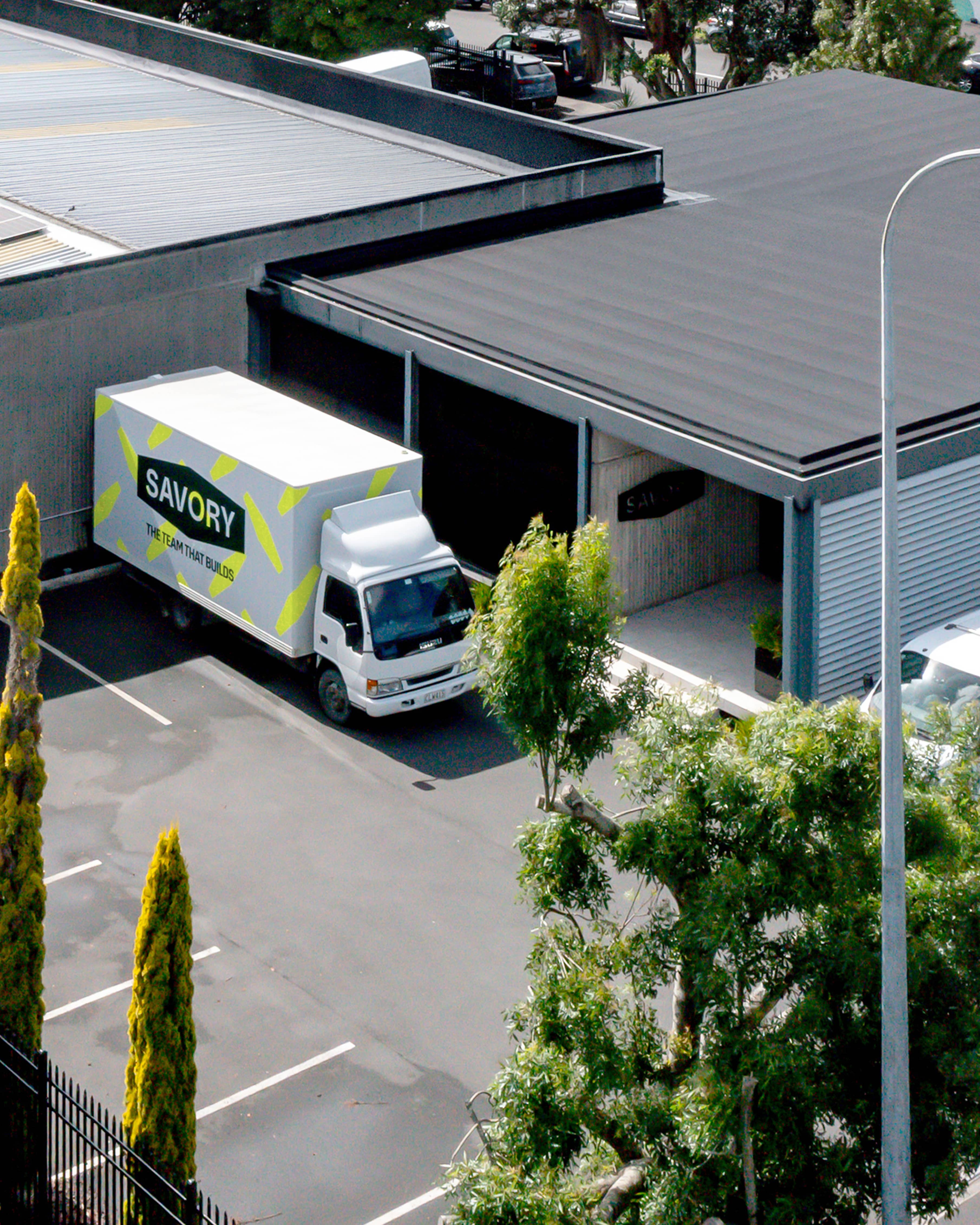
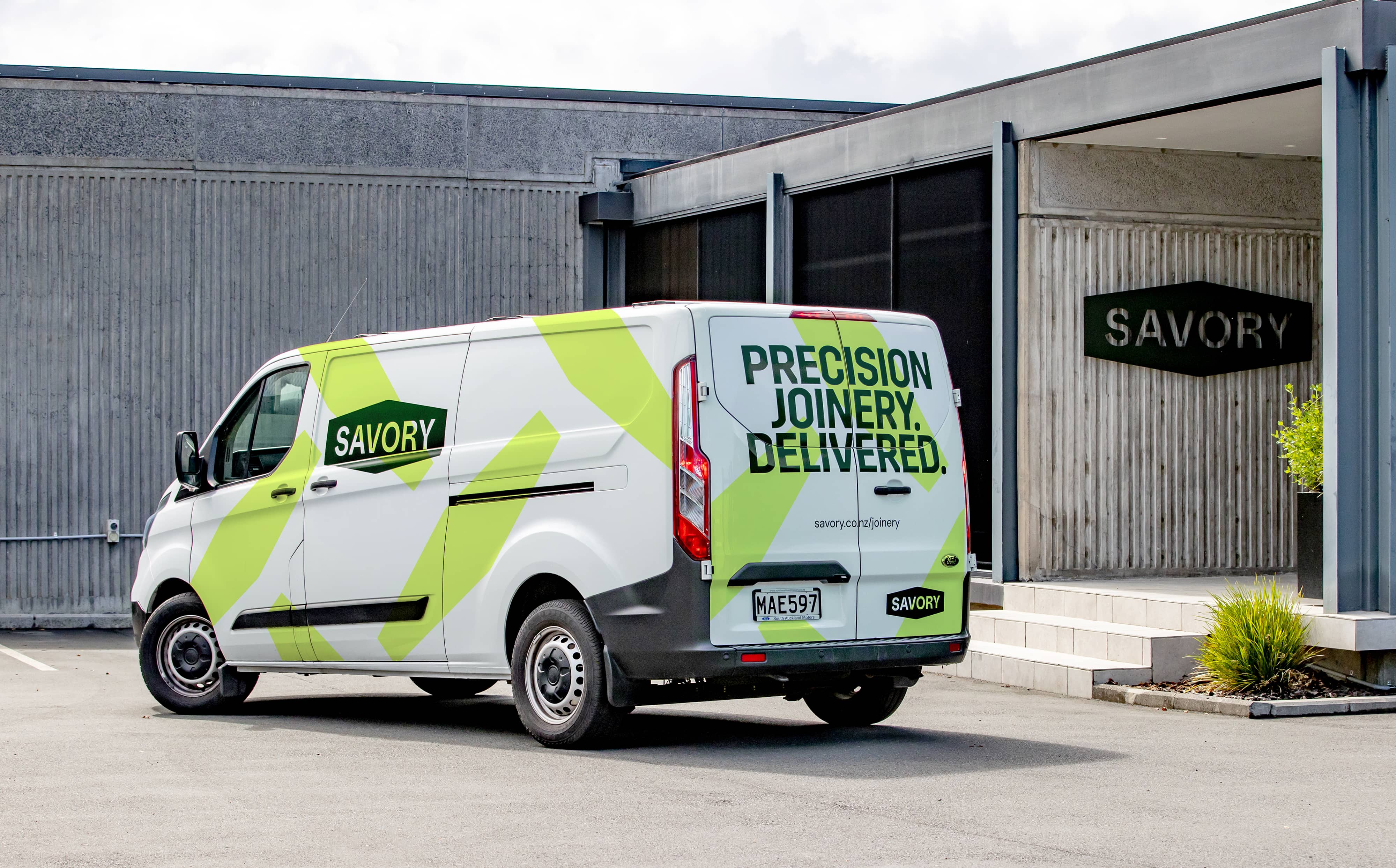
The visual identity is bold and purposeful. A strong, structural logo draws direct inspiration from the steel diamond-plate commonly found underfoot on construction sites, symbolising strength and unity. This form expands into a dynamic pattern and visual language that represents the team as a whole — many parts working together as one. Robust, functional typography ensures the brand works hard in real-world applications, supported by a palette drawn from the construction landscape, combining grounded neutrals with high-visibility yellow to signal confidence, progress, and momentum.
The result is a brand that feels human, credible, and built to last, an honest expression of Savory today and the future they’re building.
Brand Identity
Copywriting
Website
Content
Rollout
Photographers
Alistair Guthrie
Yuki Sato
Kevin Ku
Website
Icy Development