The Sweet Spot
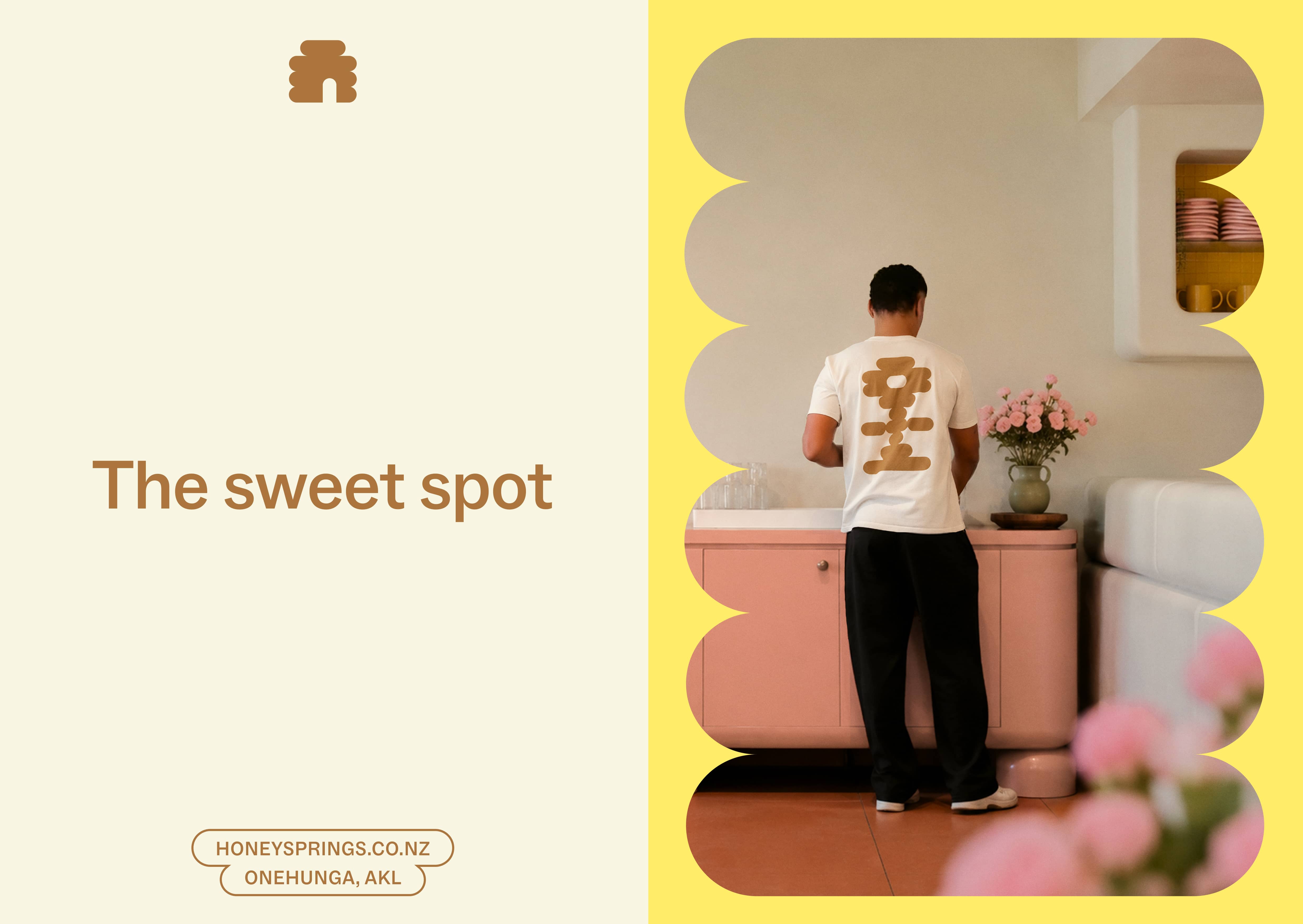
Honey Springs was created as more than a café; it was imagined as a place overflowing with warmth, generosity and sweetness.
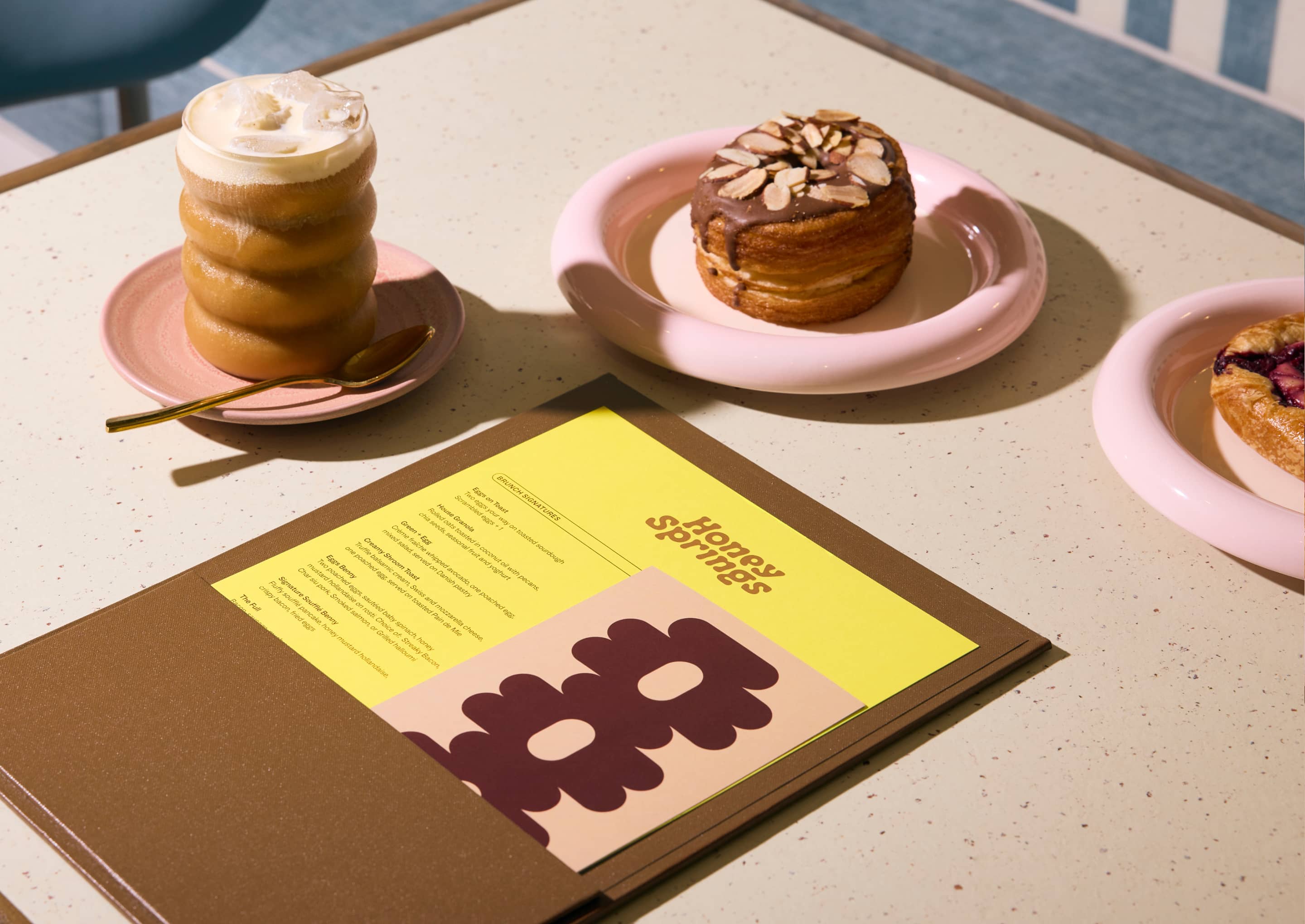
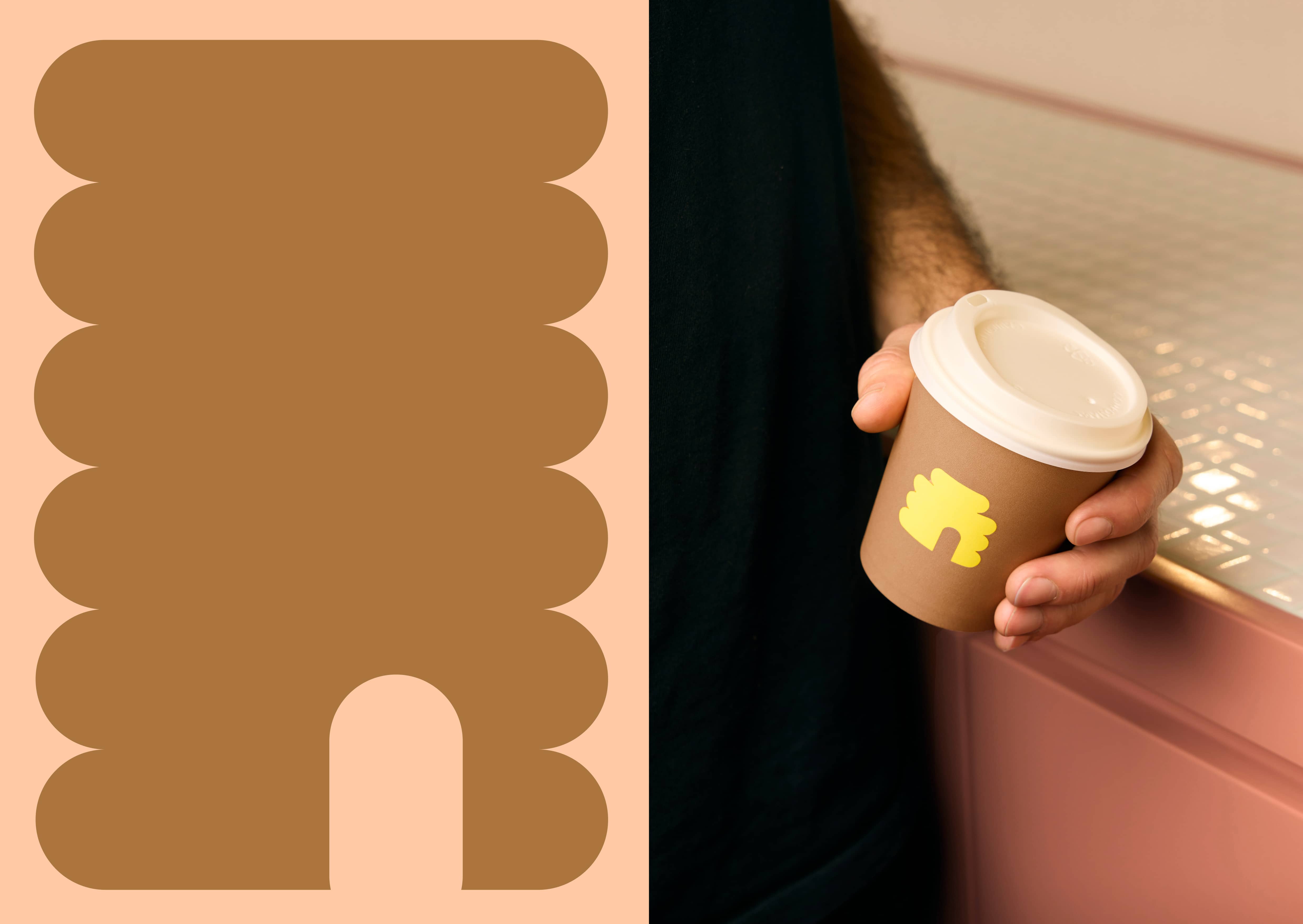
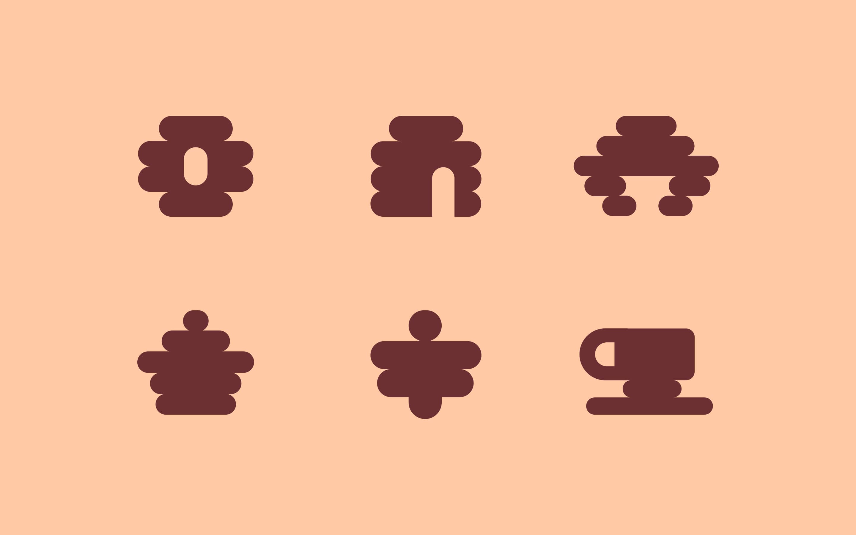
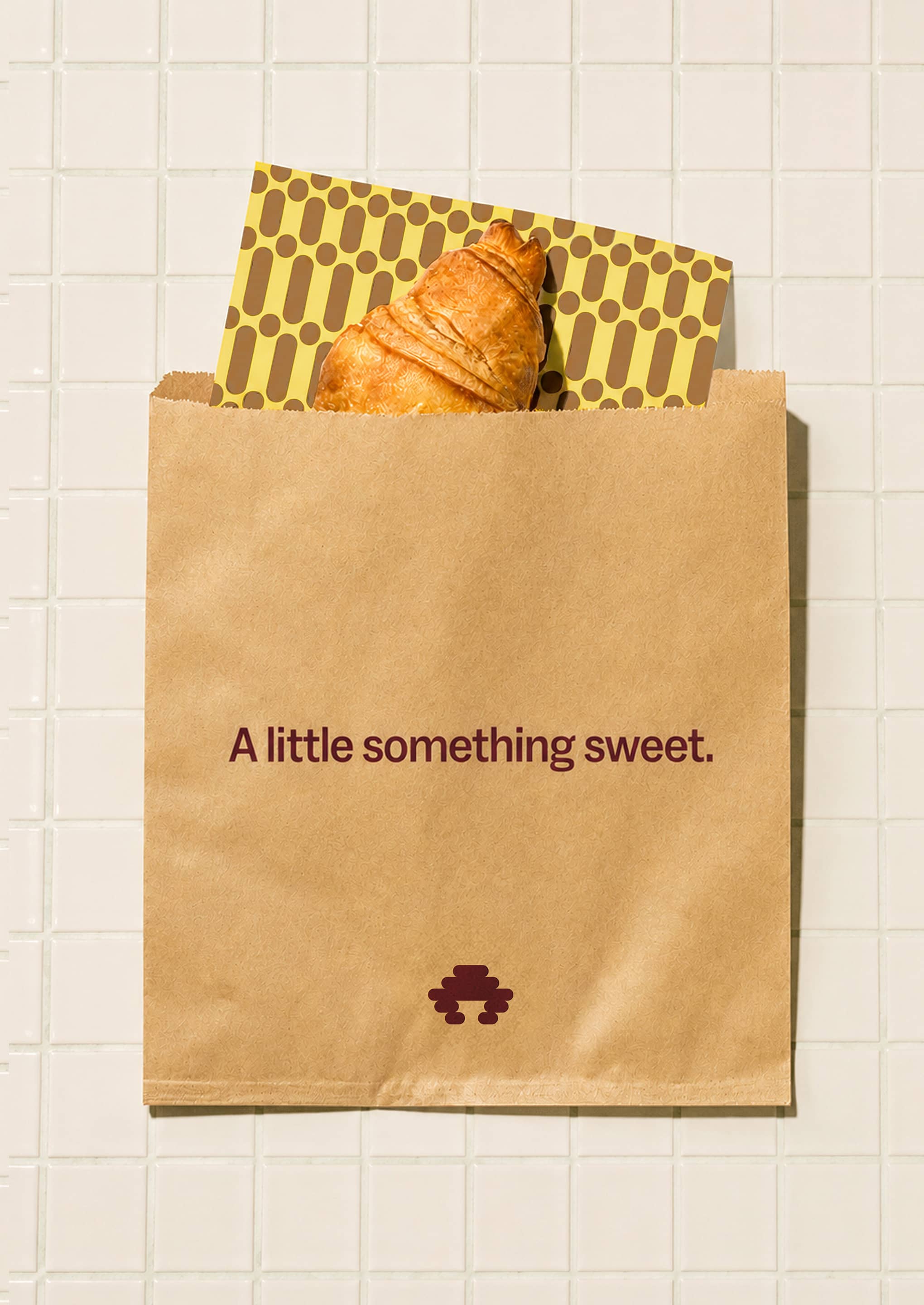
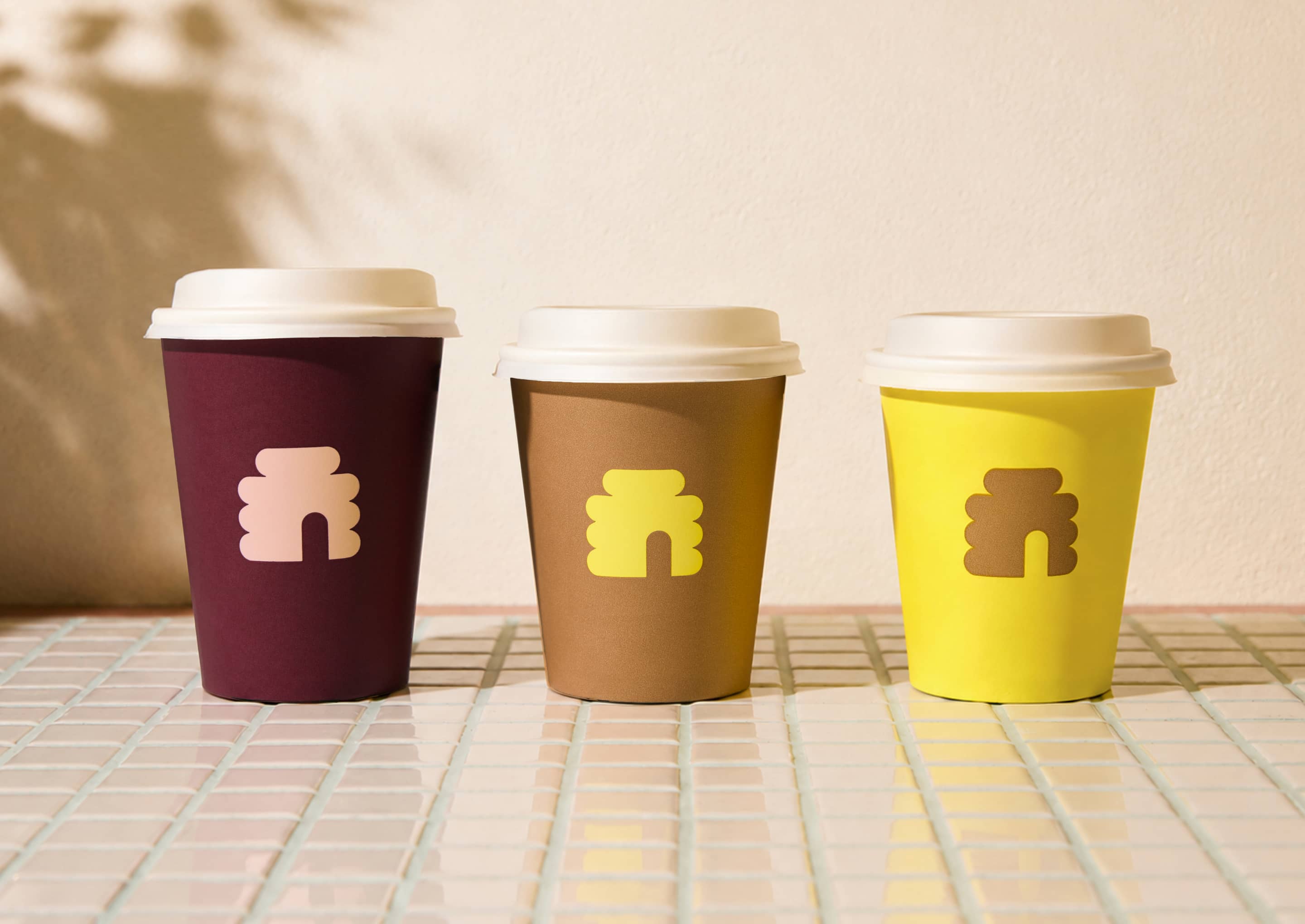
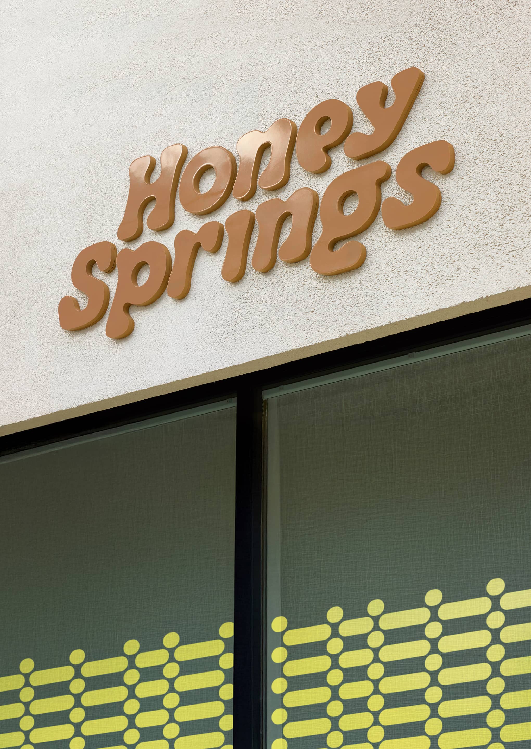
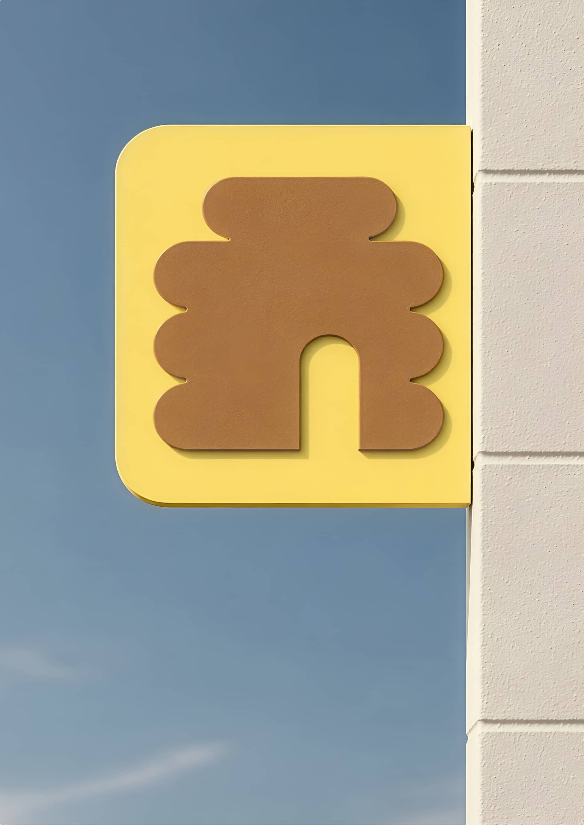
Inspired by the energy and community of a thriving hive, we developed a brand centred on this idea of creating a place always buzzing with life. A distinctive hive brandmark, flowing custom wordmark, honeyed palette and expressive visual language, translated the qualities of honey into every touchpoint, from signage and interiors to packaging and communications. The result is a cohesive brand experience that has helped Honey Springs build a loyal community and become a beloved local destination.
Scope of Services
Visual Identity
Art Direction
Messaging
Signage & Wayfinding
Partners
Yuki Sato
Sam Anderson