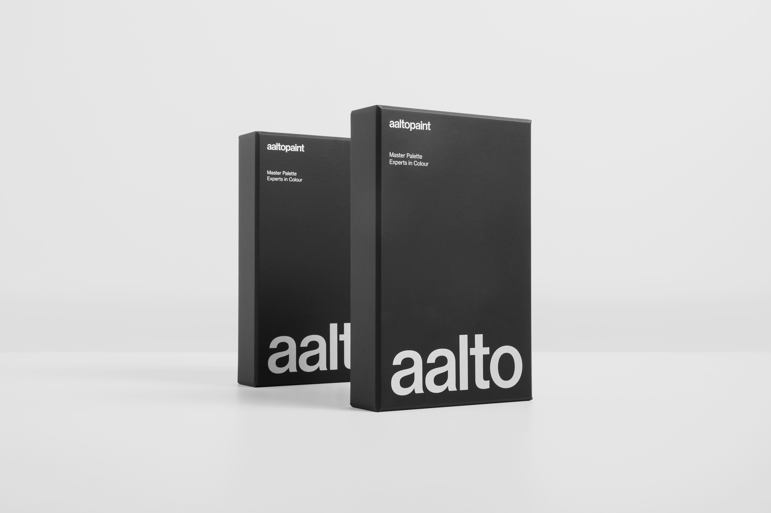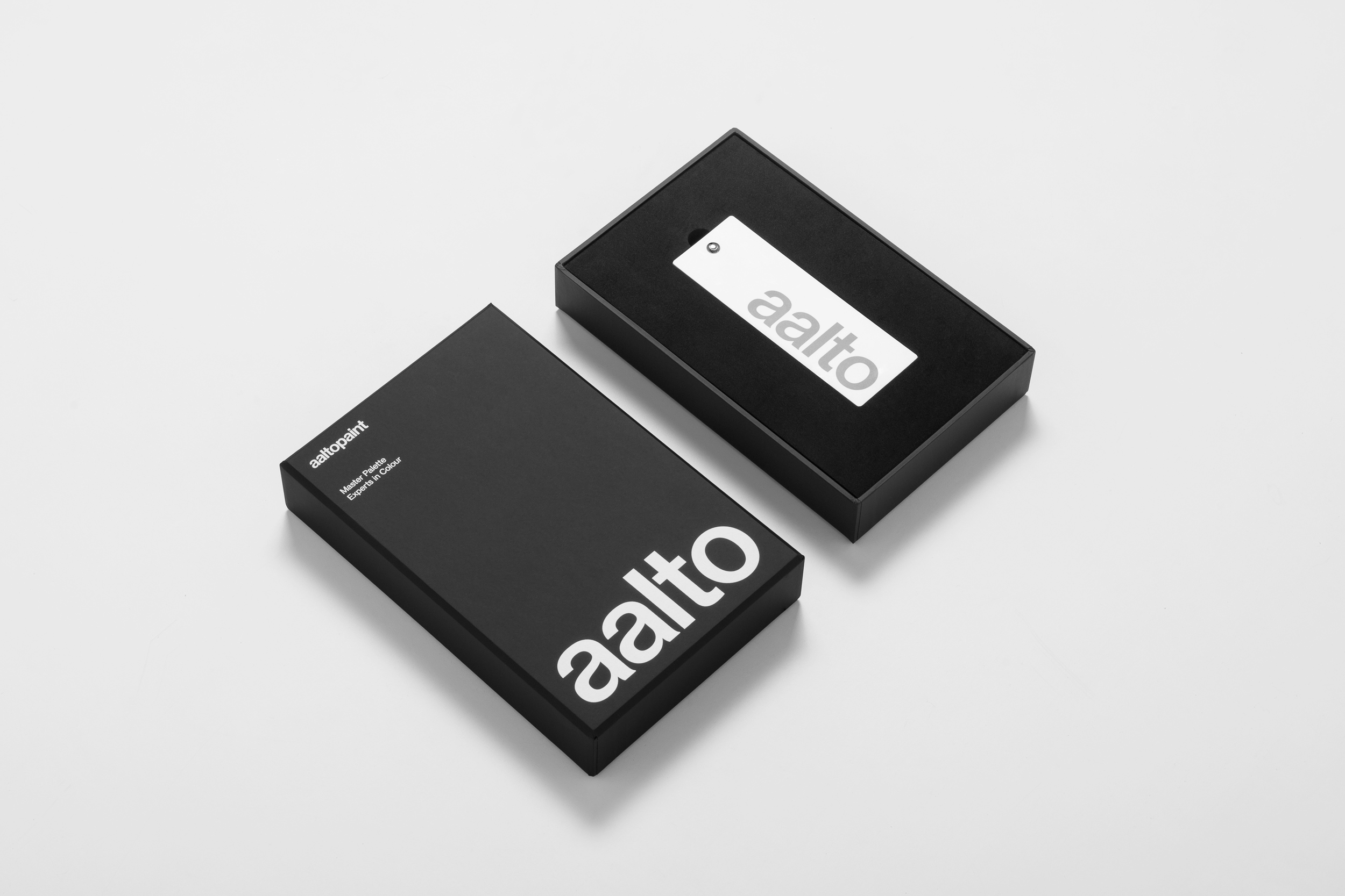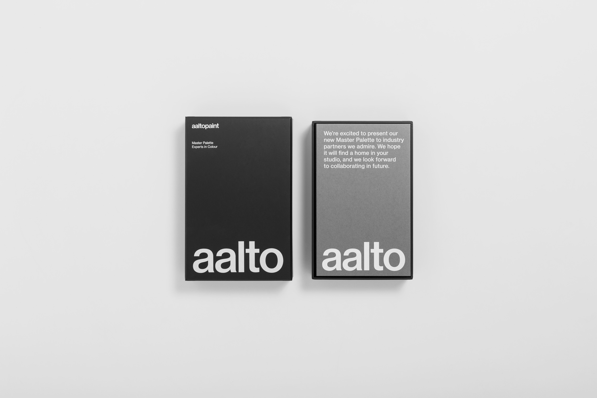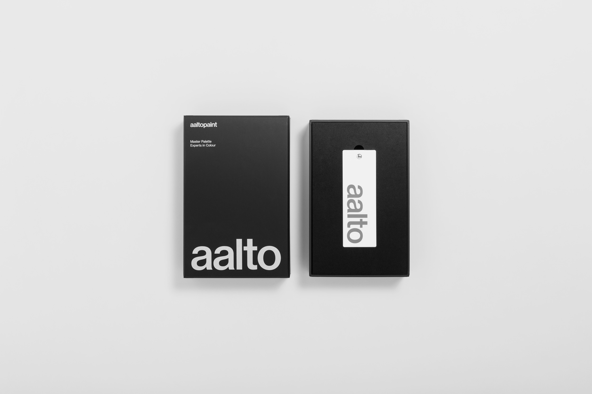
A refined brand system for a premium paint company.
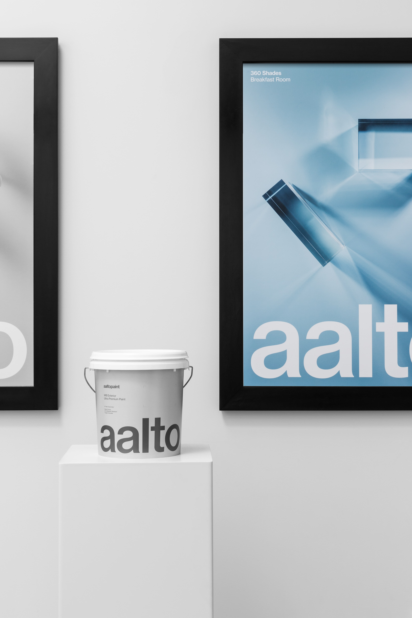
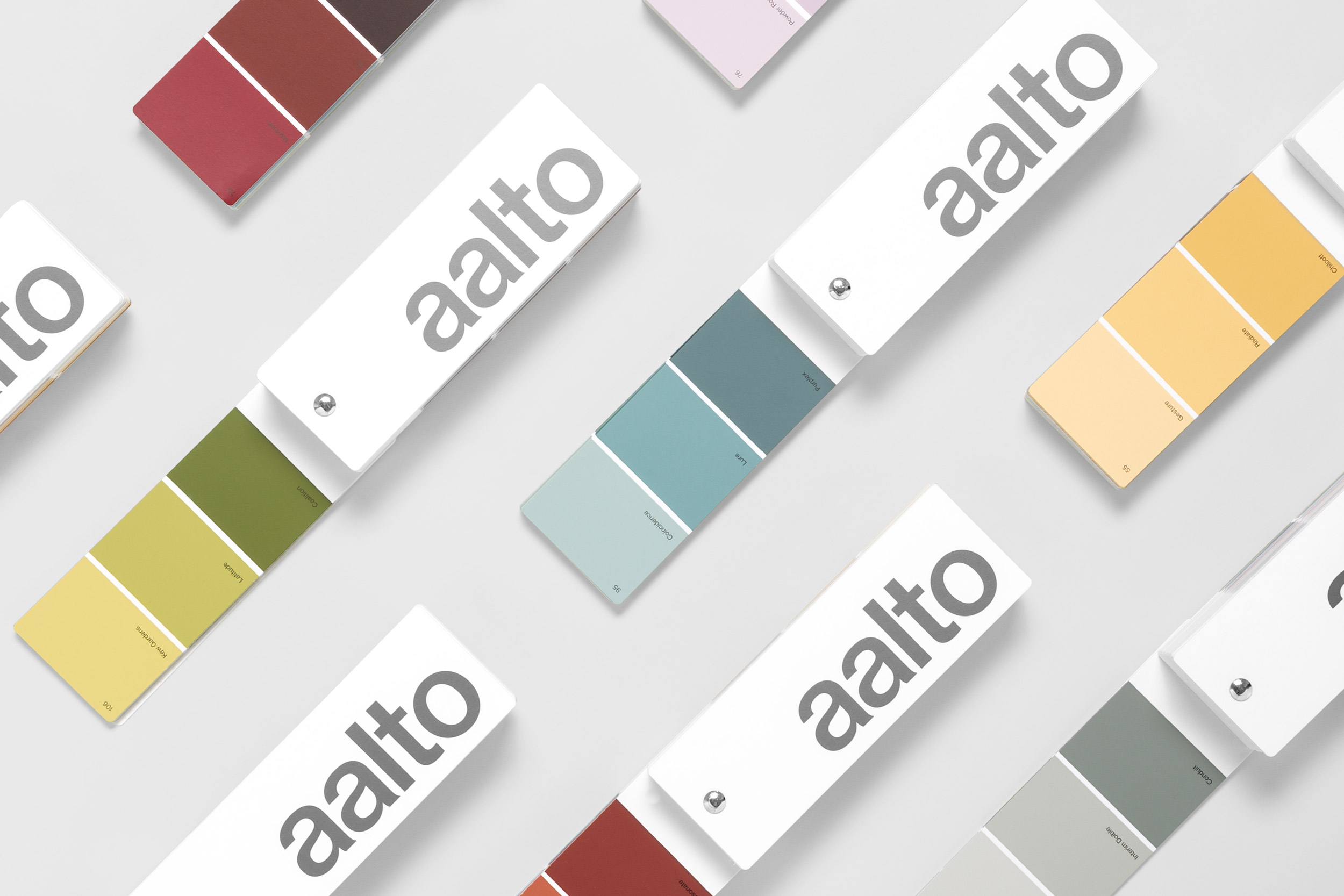
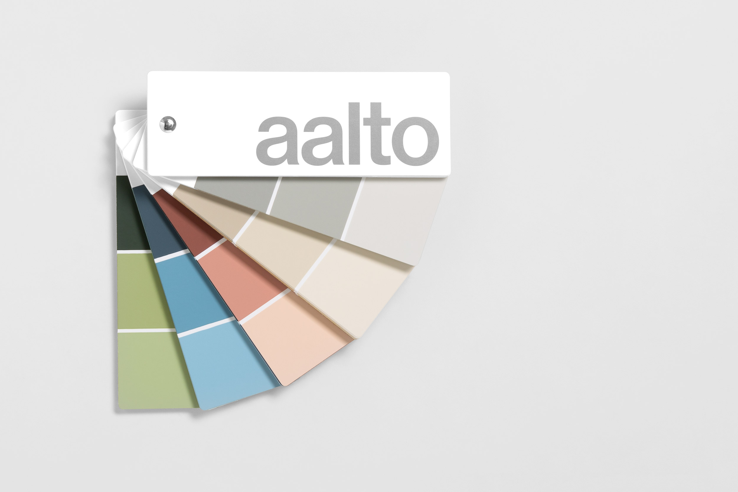
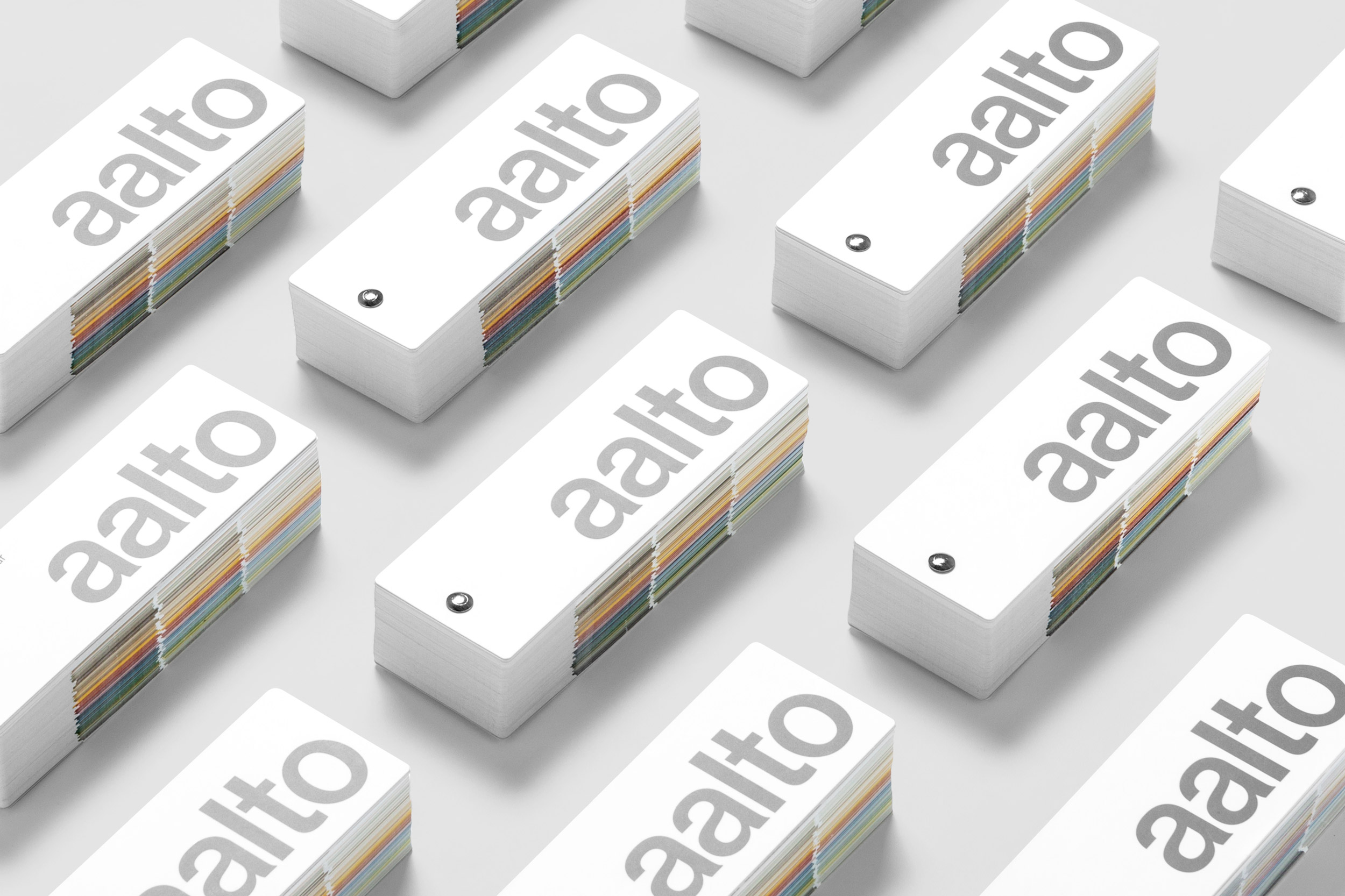
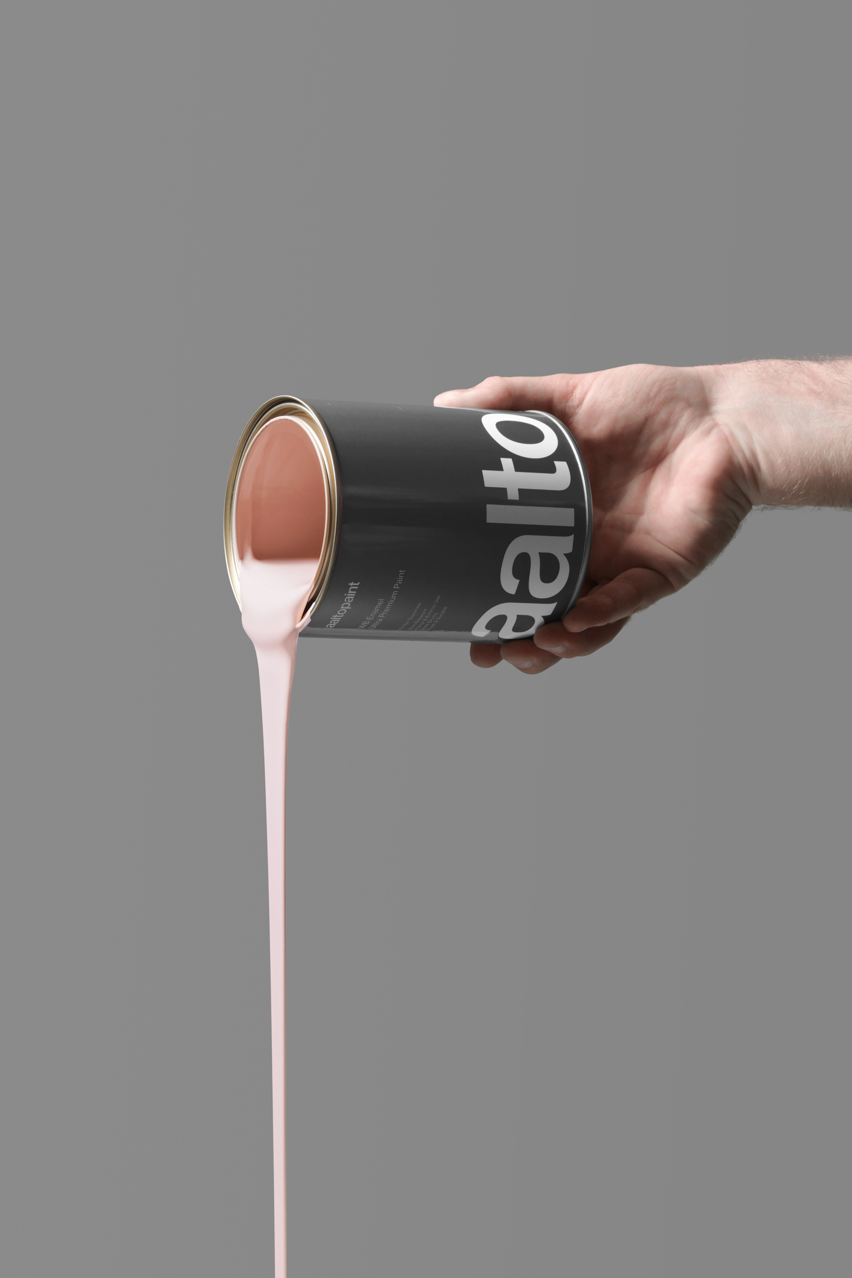
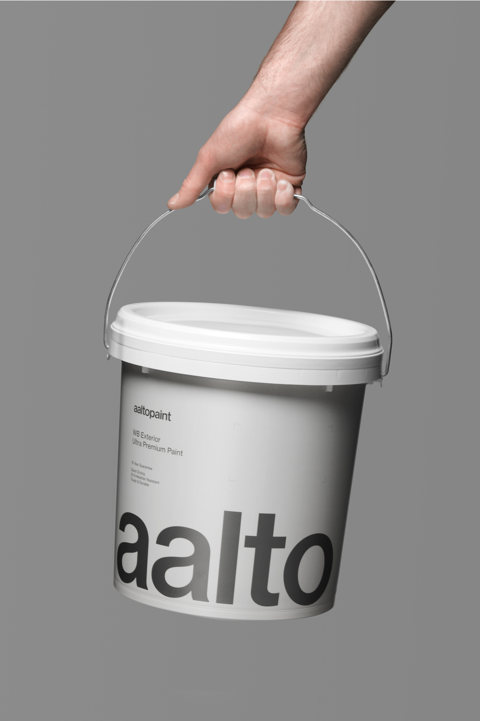
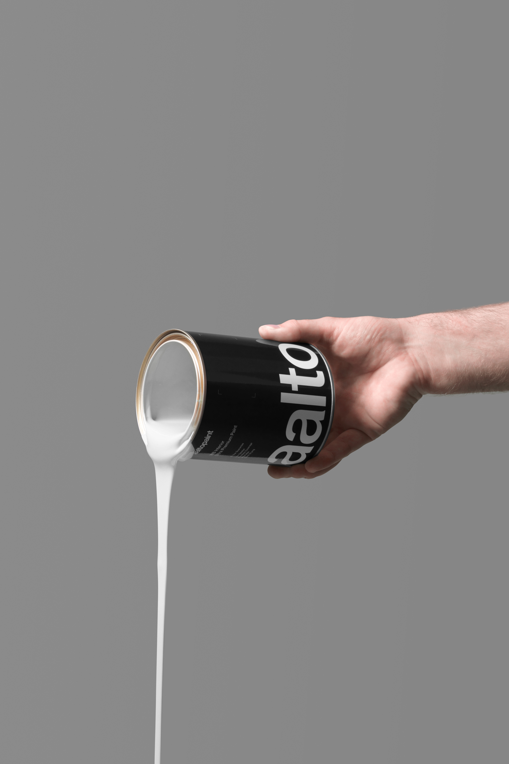
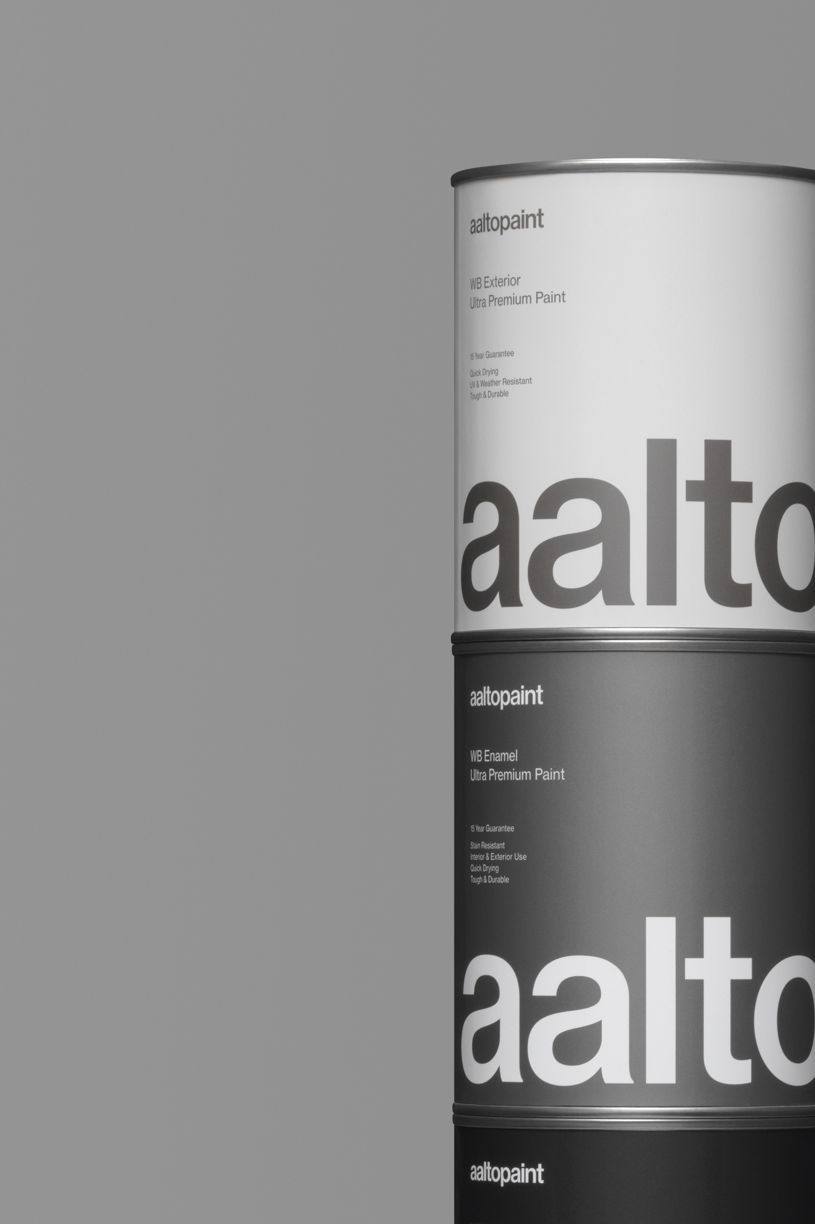
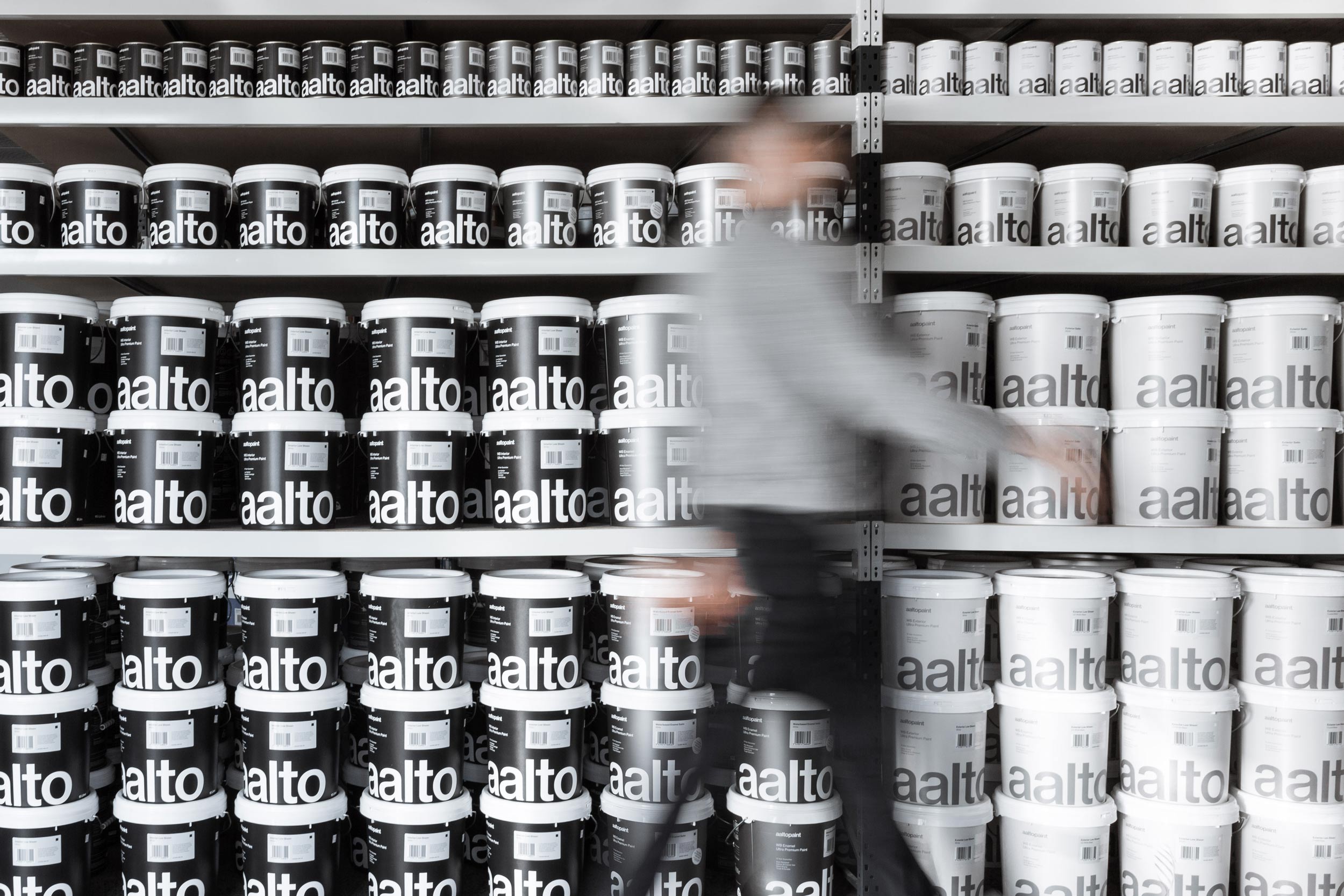
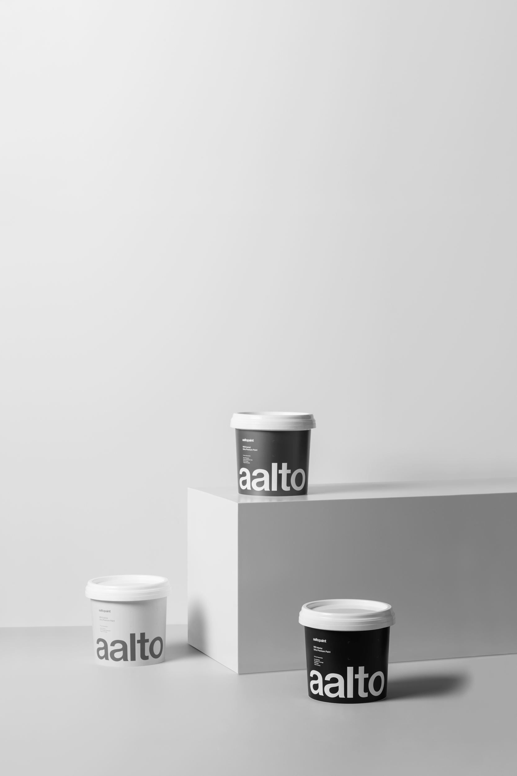
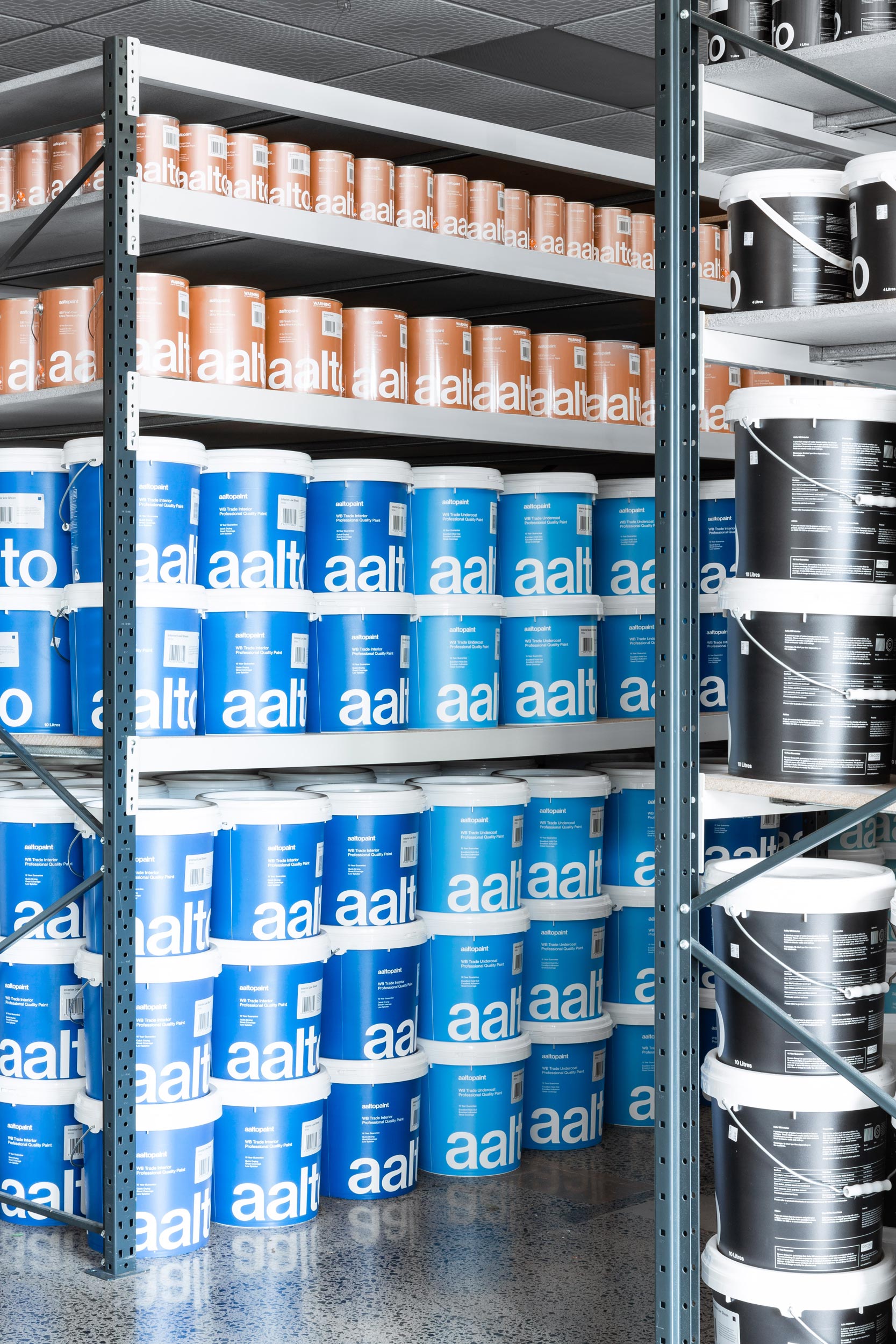
Aalto Paint is a New Zealand owned and operated company. They pride themselves on a science-based approach to create premium multi-pigmented paints. Aalto’s unique collection of 360 shades is a carefully crafted set of neutrals and colours, for industry professionals and home decorators alike. The brand tools were stripped back to their essence, leaving a simple colour palette and a refined typographic treatment. For the paint buckets and tins, carefully constructed hierarchy systems ensured a uniform appearance across the different sizes and formats.
Photography
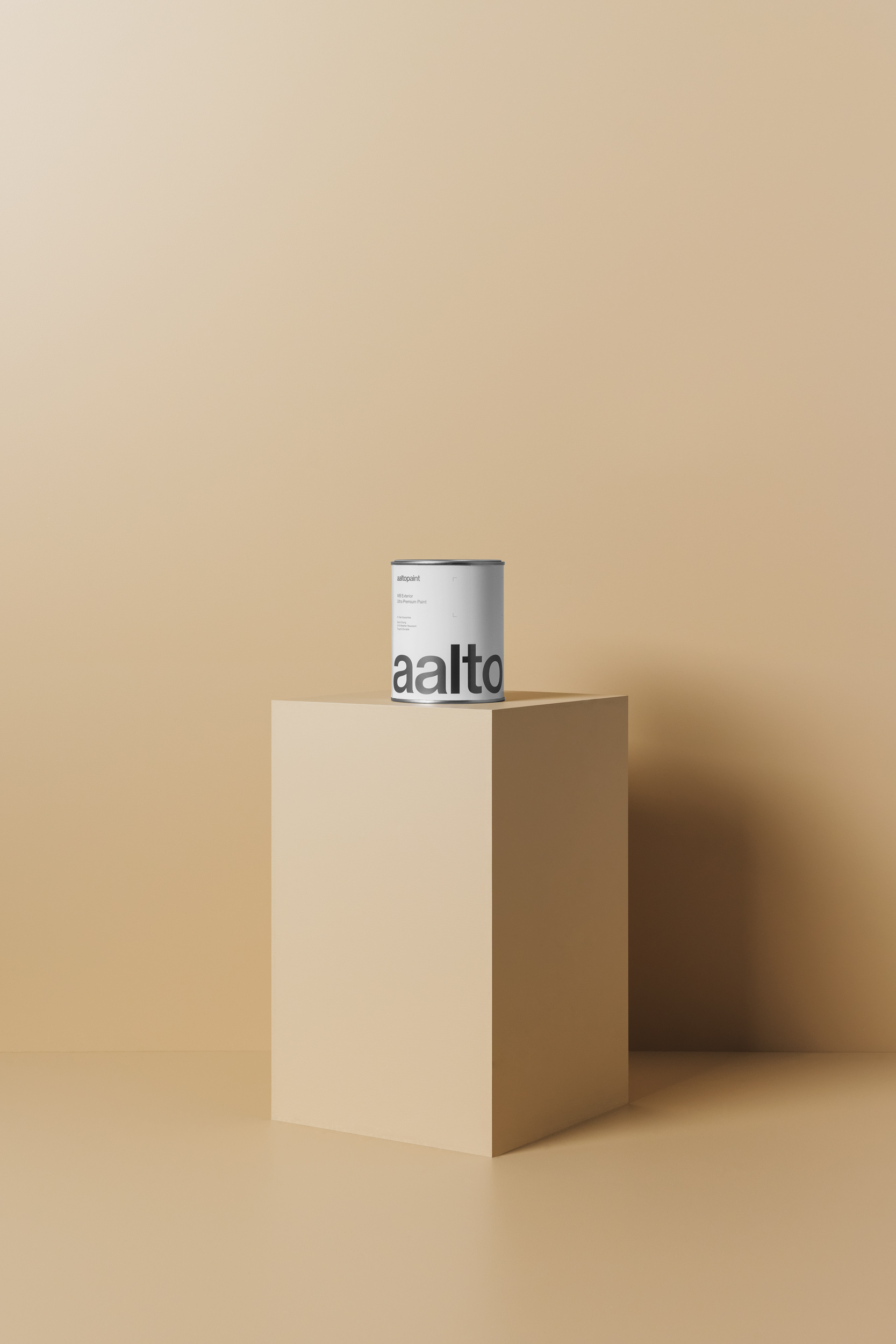
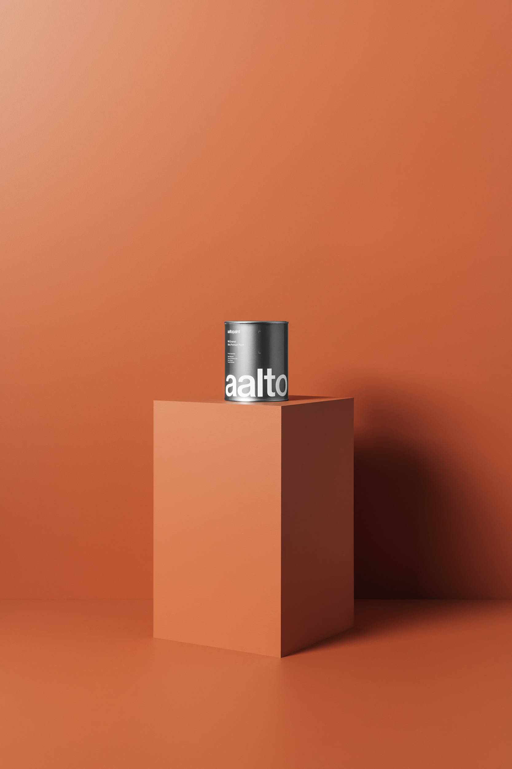
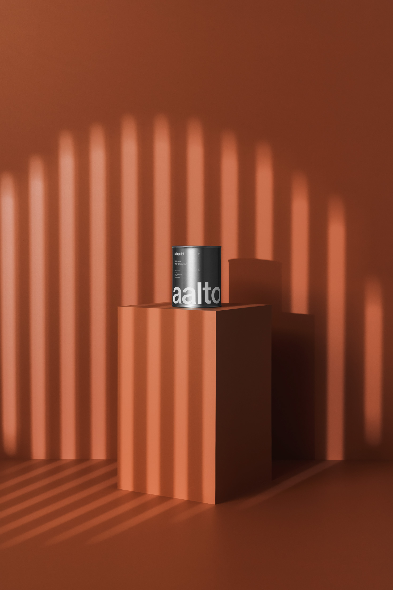
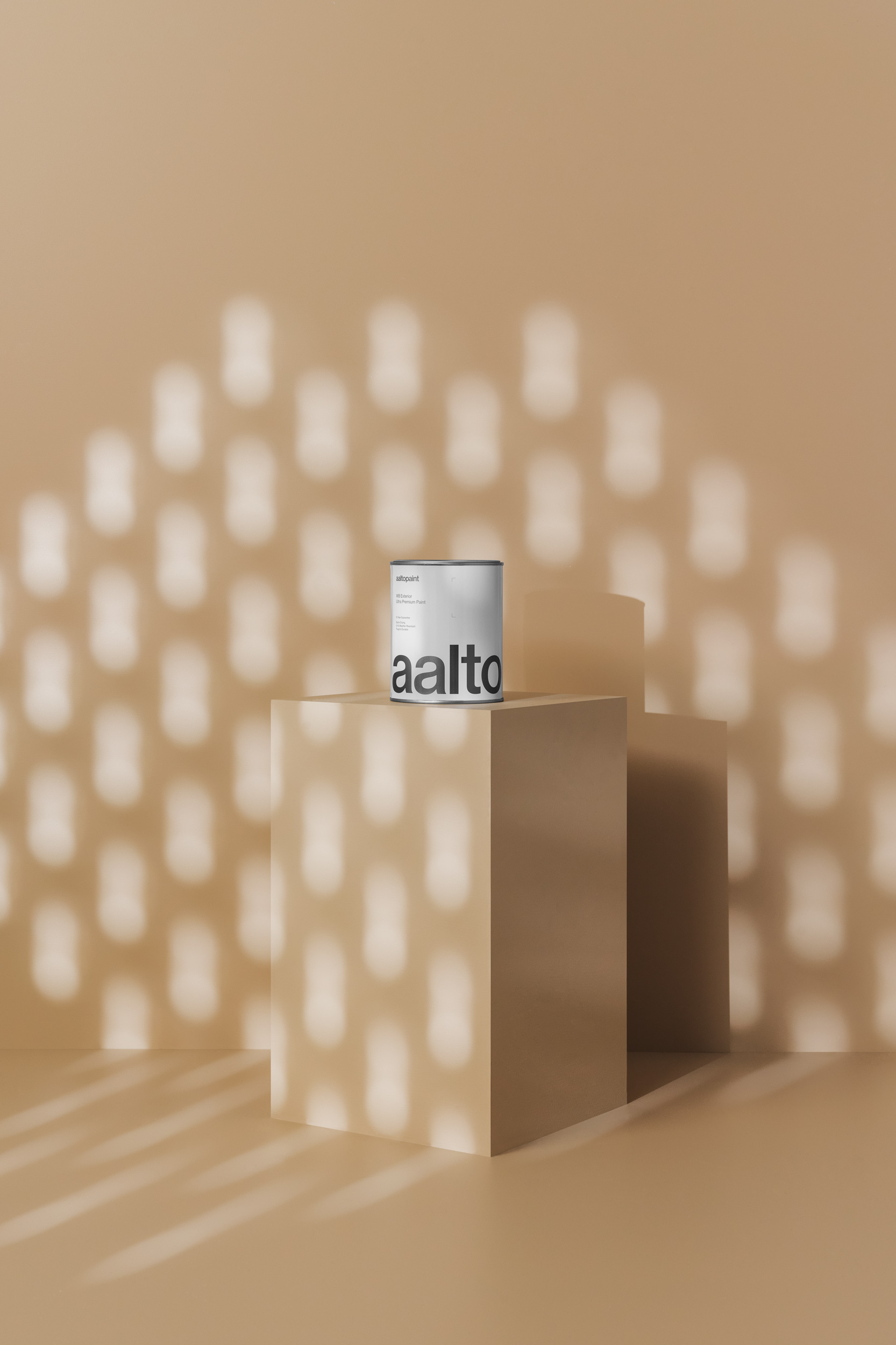
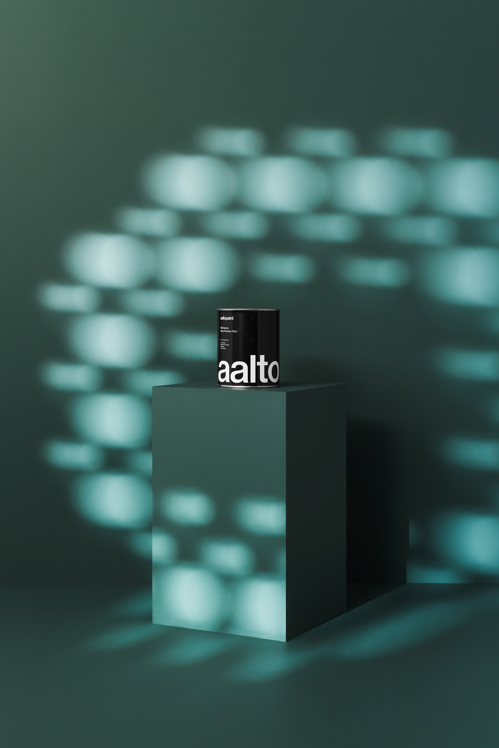

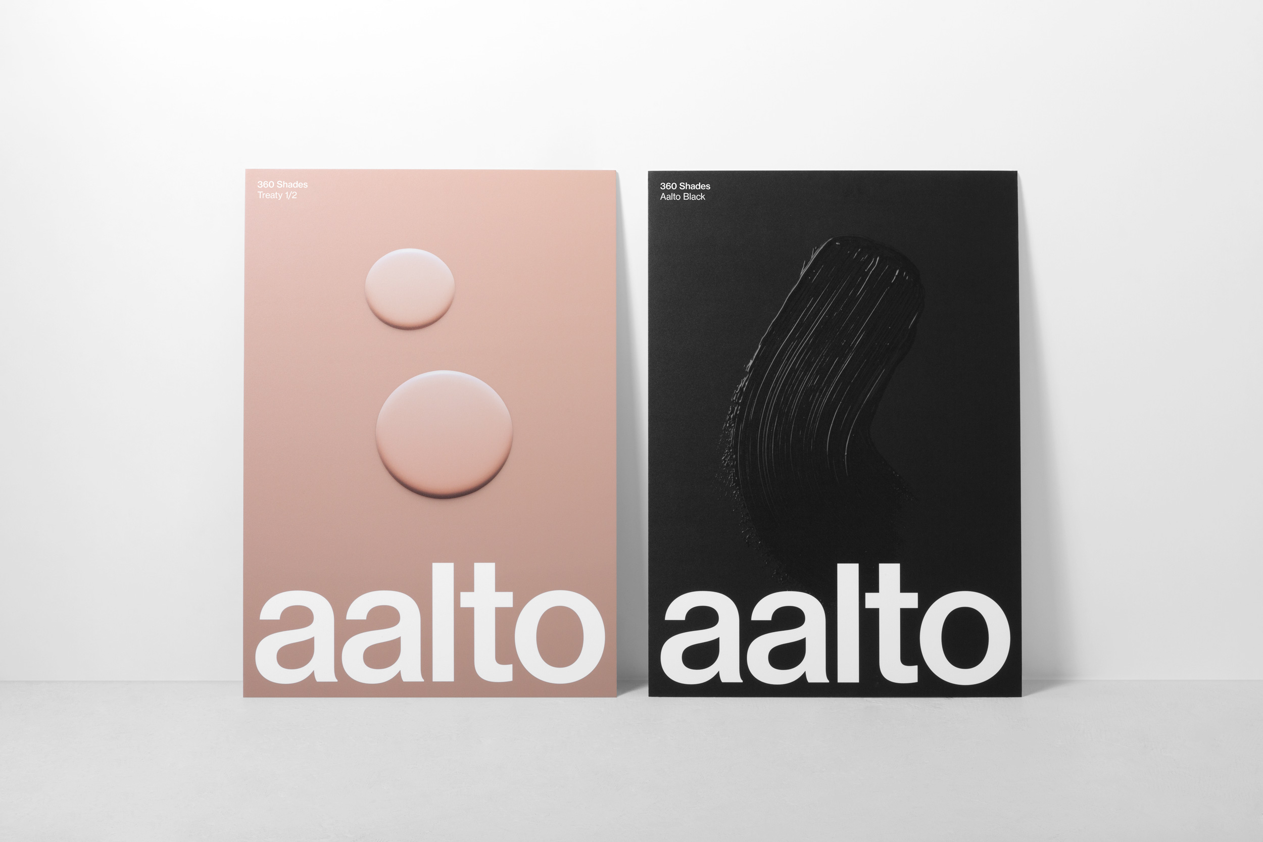
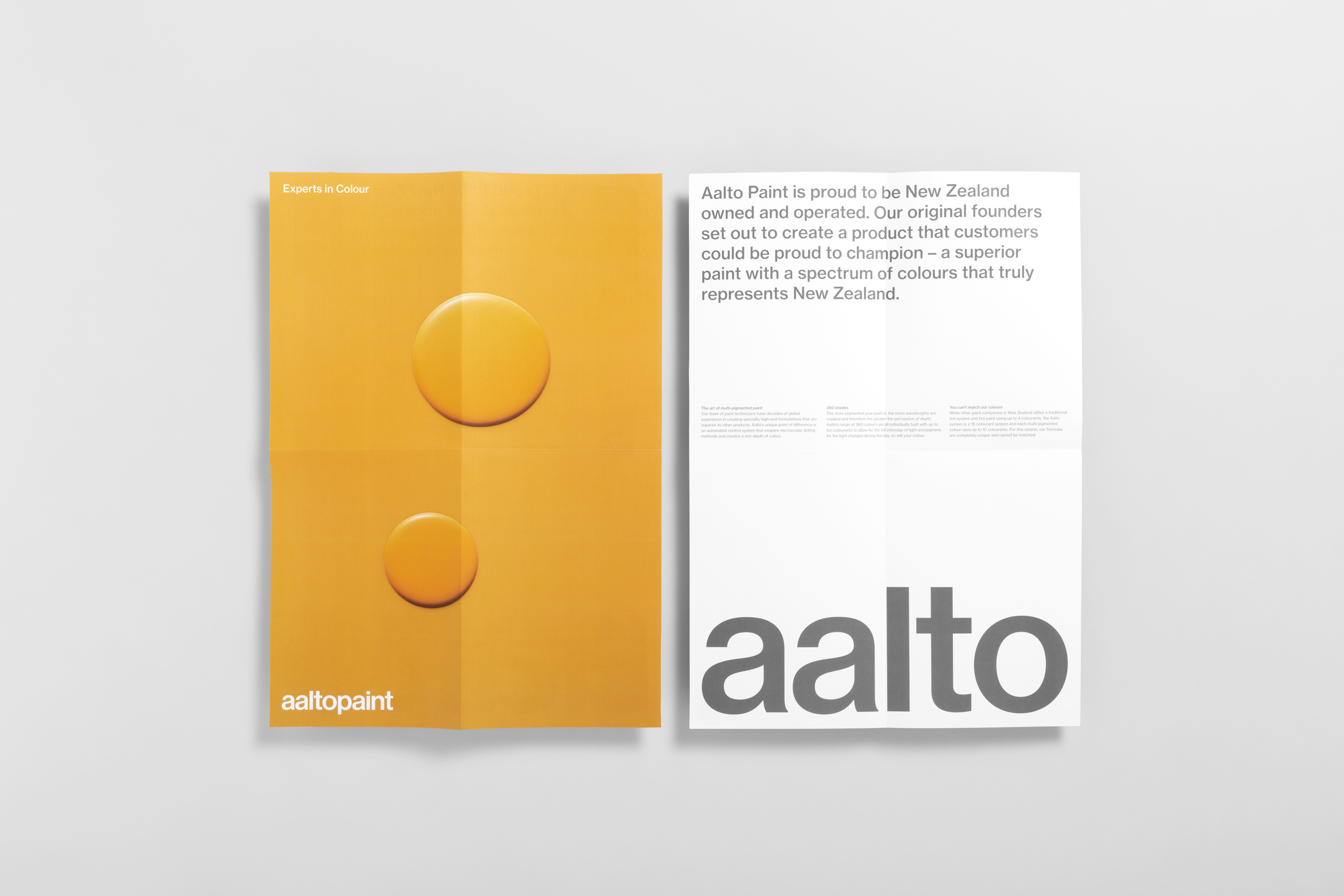
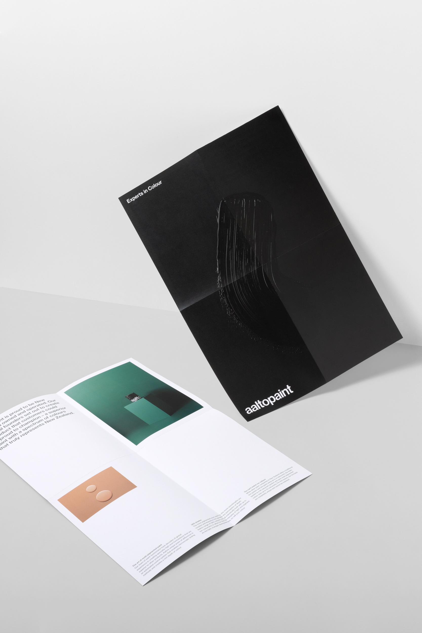
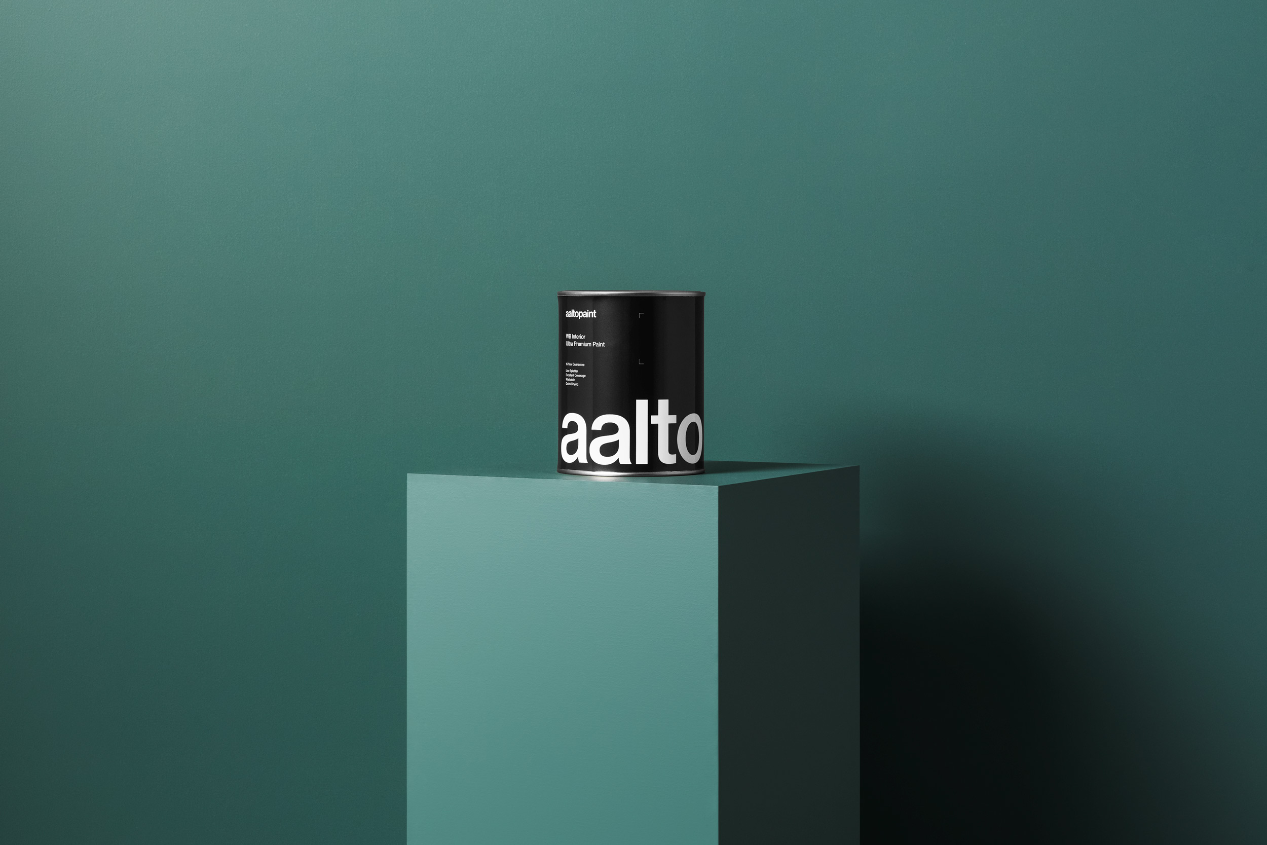
Aalto looked to communicate the multi-pigmented nature of their paint, the range of their colour palette and the science behind the process. An imagery set was developed to showcase the range and depth of colour, and the way the pigments react to light. Paint drops and smears were carefully lit and photographed, becoming almost sculptural in their simplicity. Plinths and backdrops were painted in a single colour to demonstrate the variation in hue, and acrylic blocks were lit to show the play of light on the paint. Graphic elements representing resin, water and powder were created to illustrate the scientific mixing process, and these were turned into stencils and projected across the environment. Finally, the three-dimensional versions of the infographics were coated in layers of pouring paint, creating interesting textures and shapes. The resulting imagery was used as primary communications across a range of printed and digital media.
